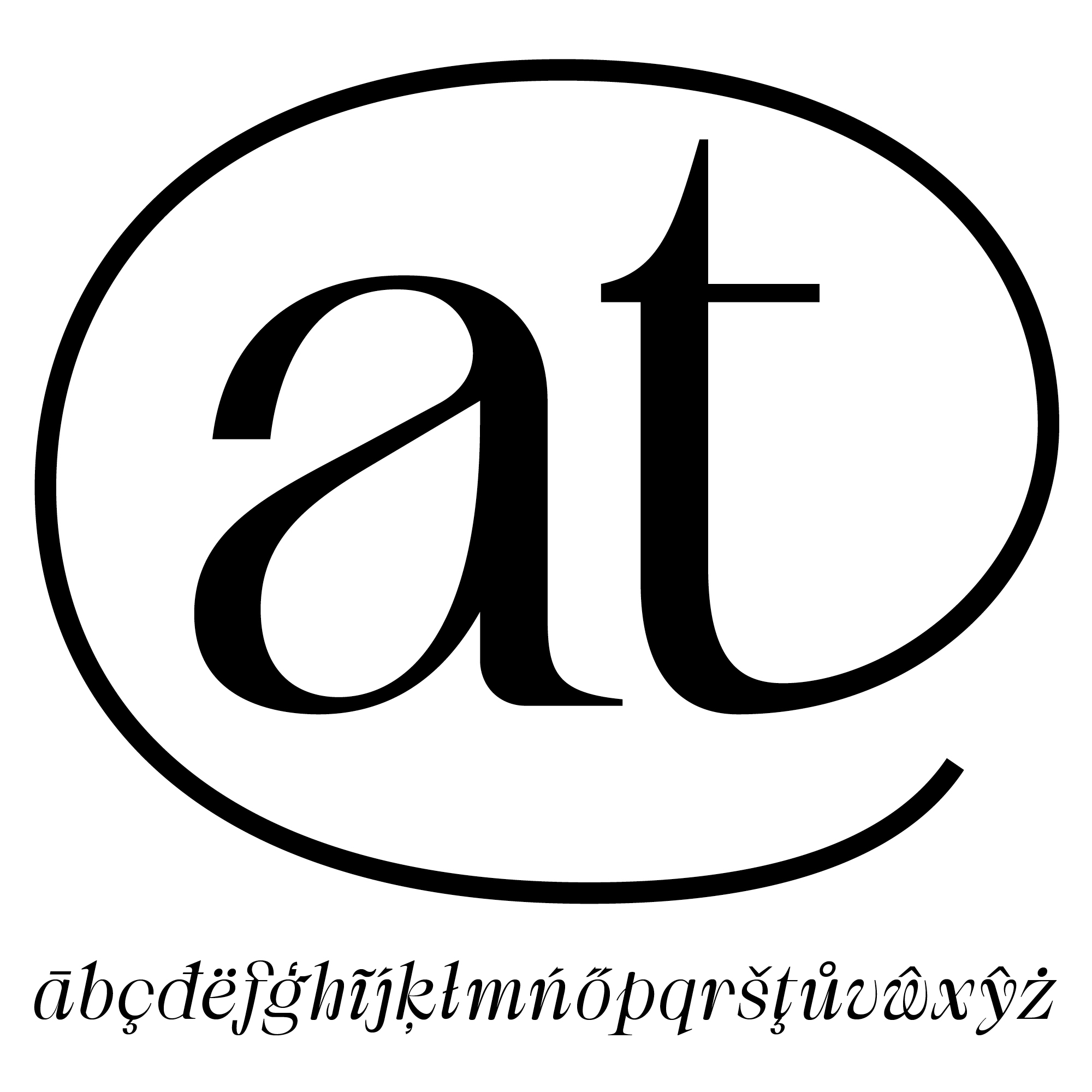
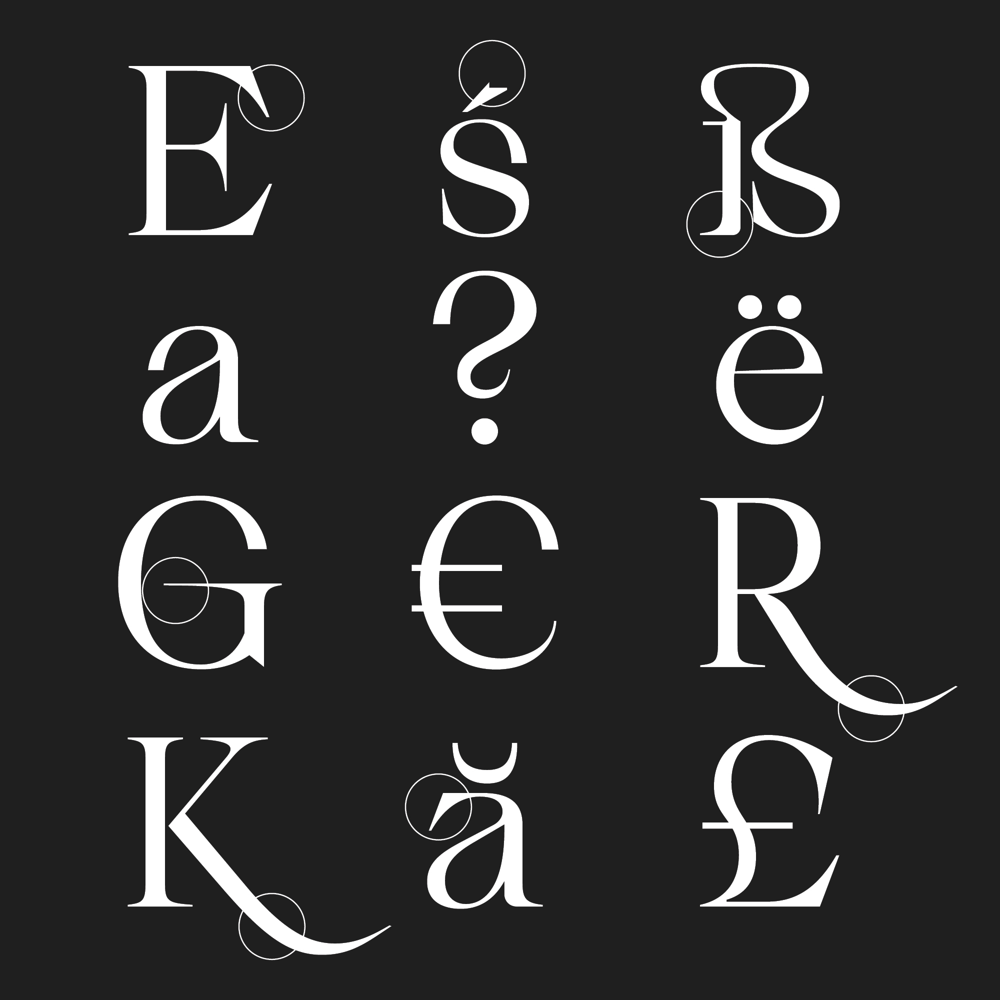
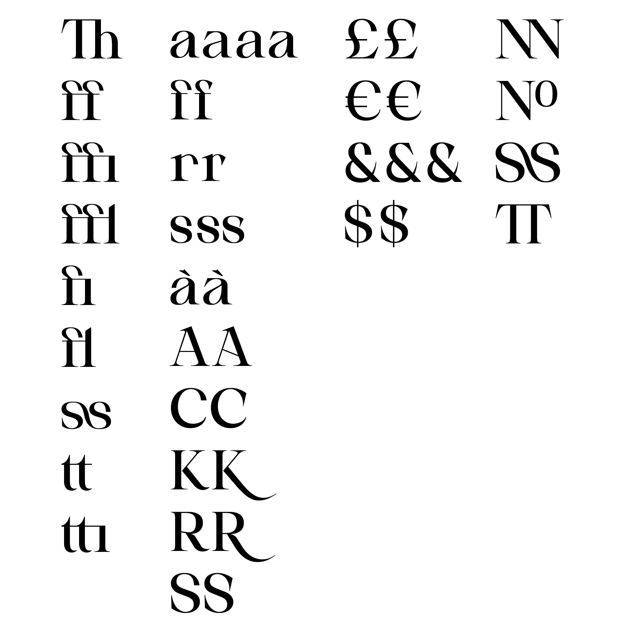
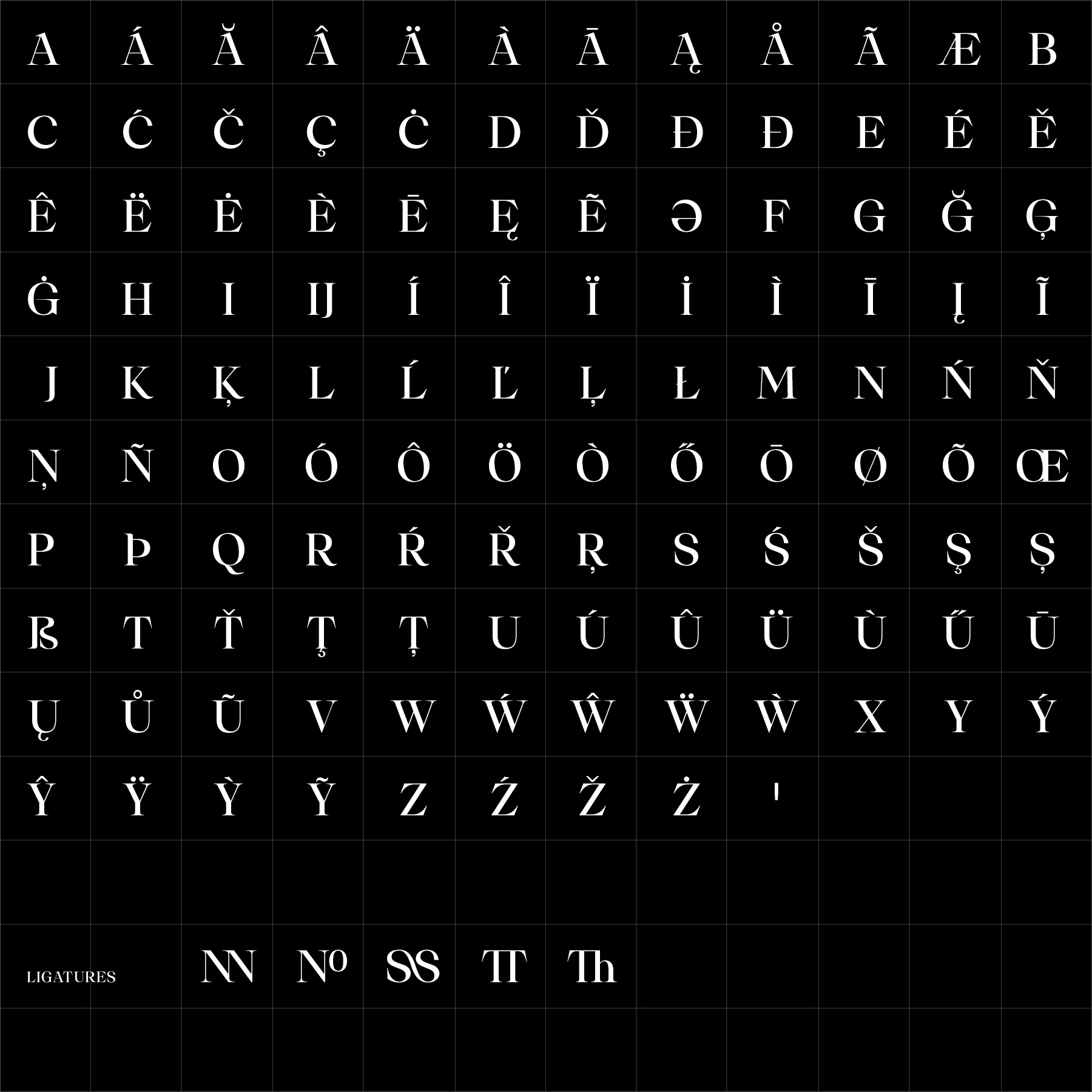
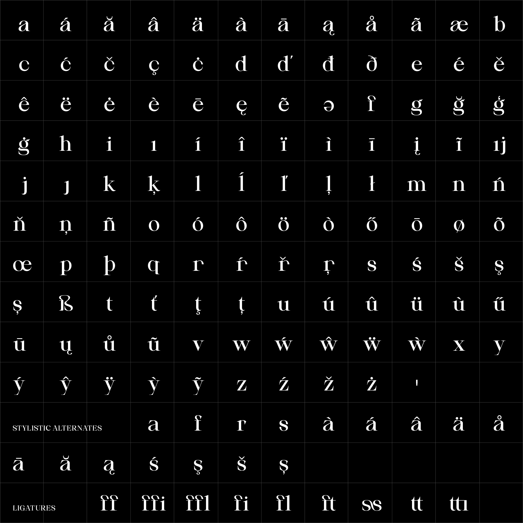
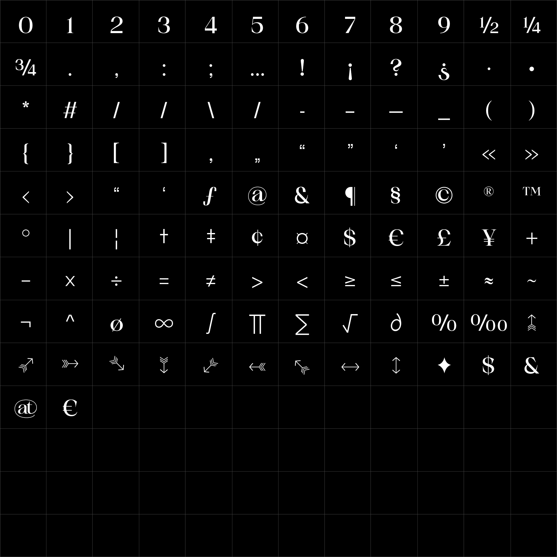
Suprala Serif combines sharp contrast, elegant proportions and a strong editorial character. Its classical serif structure is refined through cleaner detailing, giving the family a composed and authoritative voice without compromising readability.
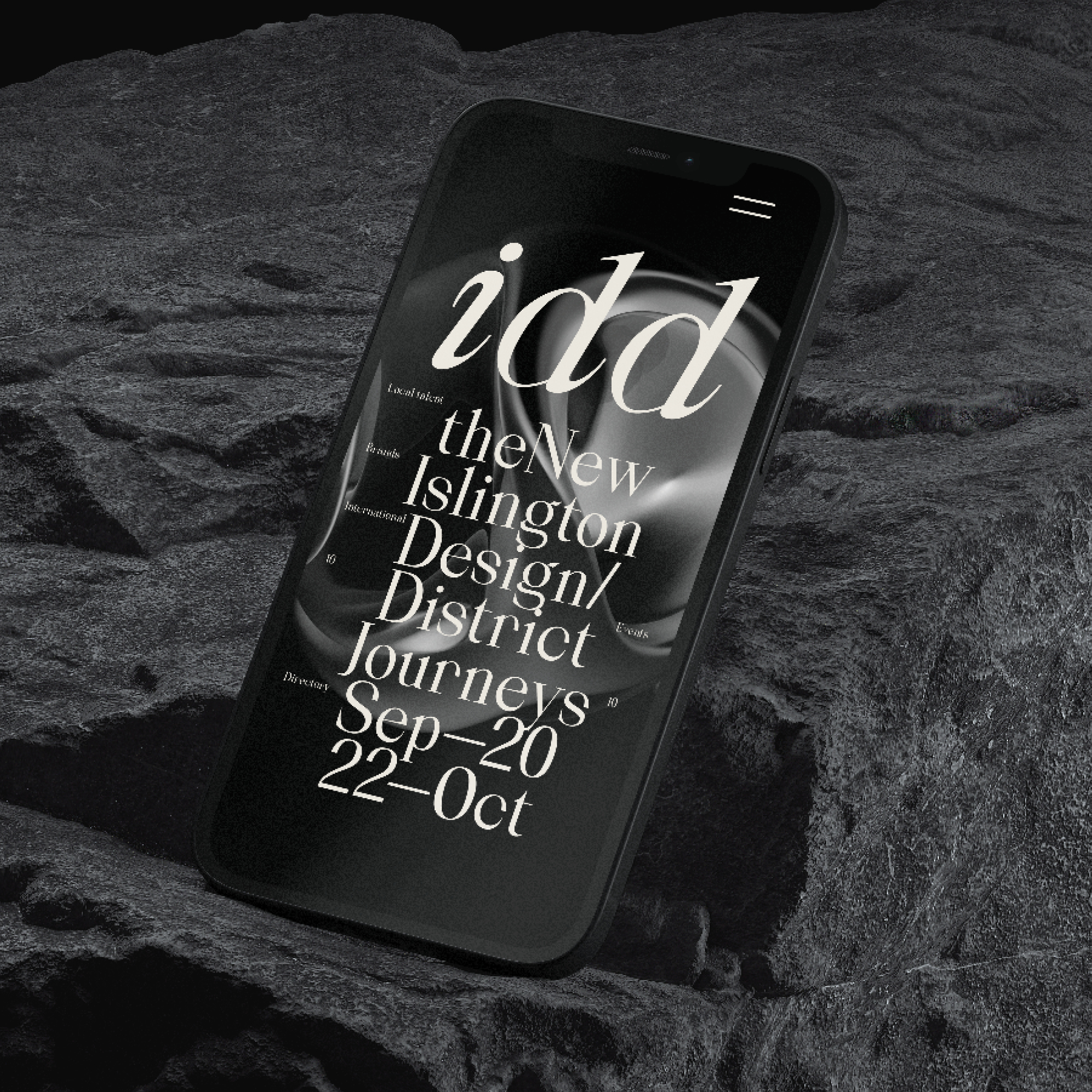
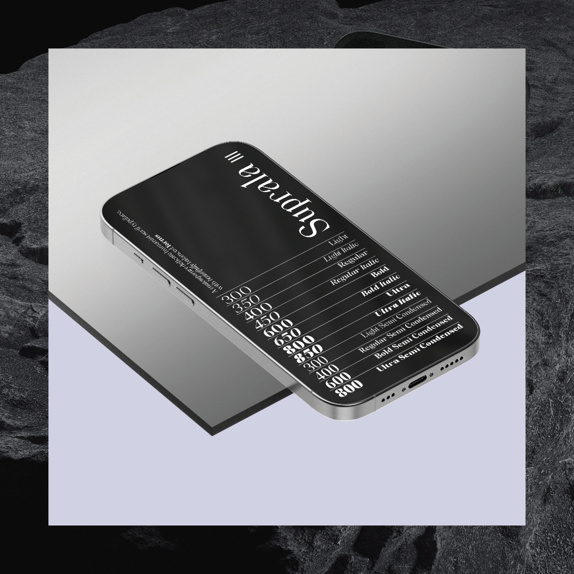
Its Roman, Italic and Condensed styles allow Suprala Serif to build varied hierarchy across publishing, branding, packaging and cultural communication while maintaining one consistent typographic identity. Suprala Serif offers designers a flexible editorial family with refined contrast, stable readability and multiple proportions for creating expressive but controlled typographic systems.
Suprala Serif can be adapted specifically for your brand—from selected characters and stylistic details to adjusted proportions, additional weights, language support or a complete proprietary serif system.