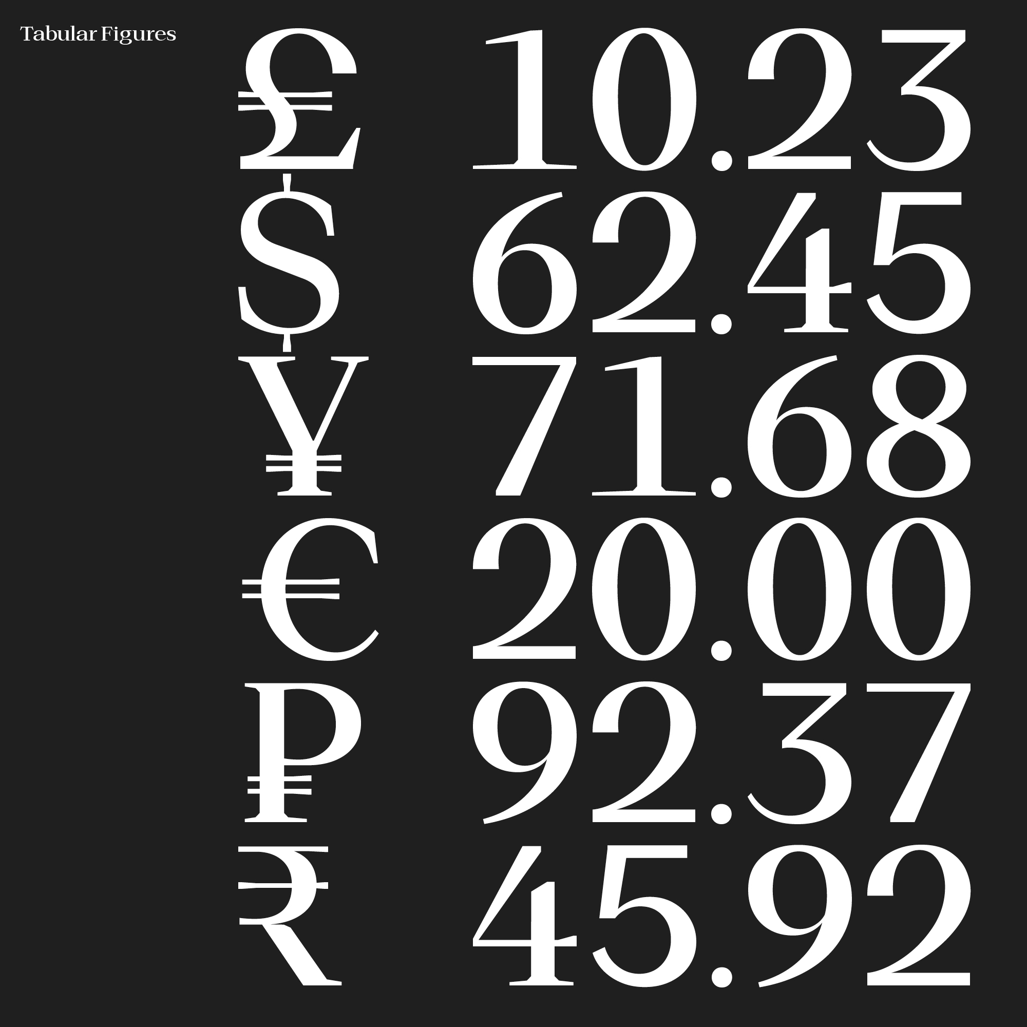
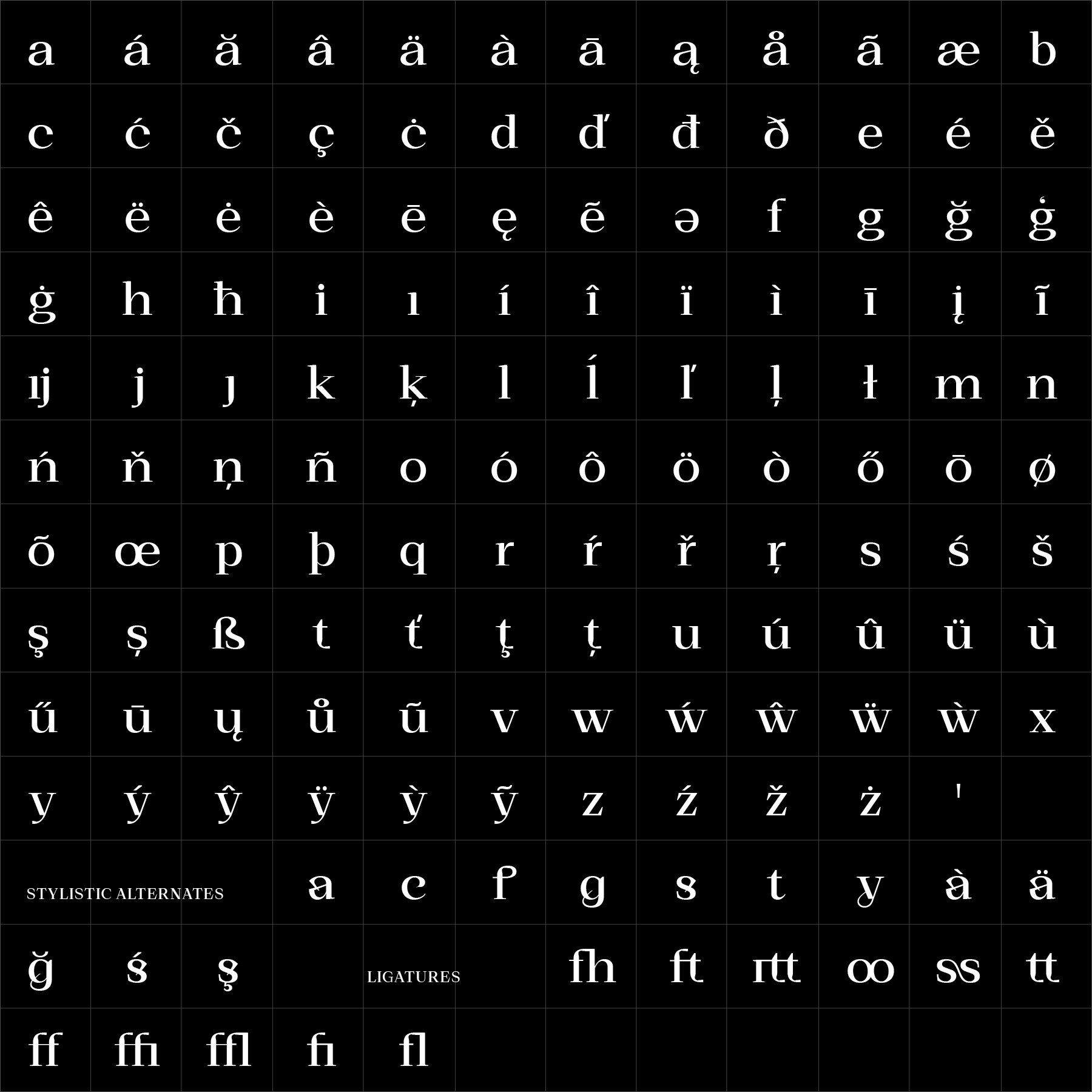
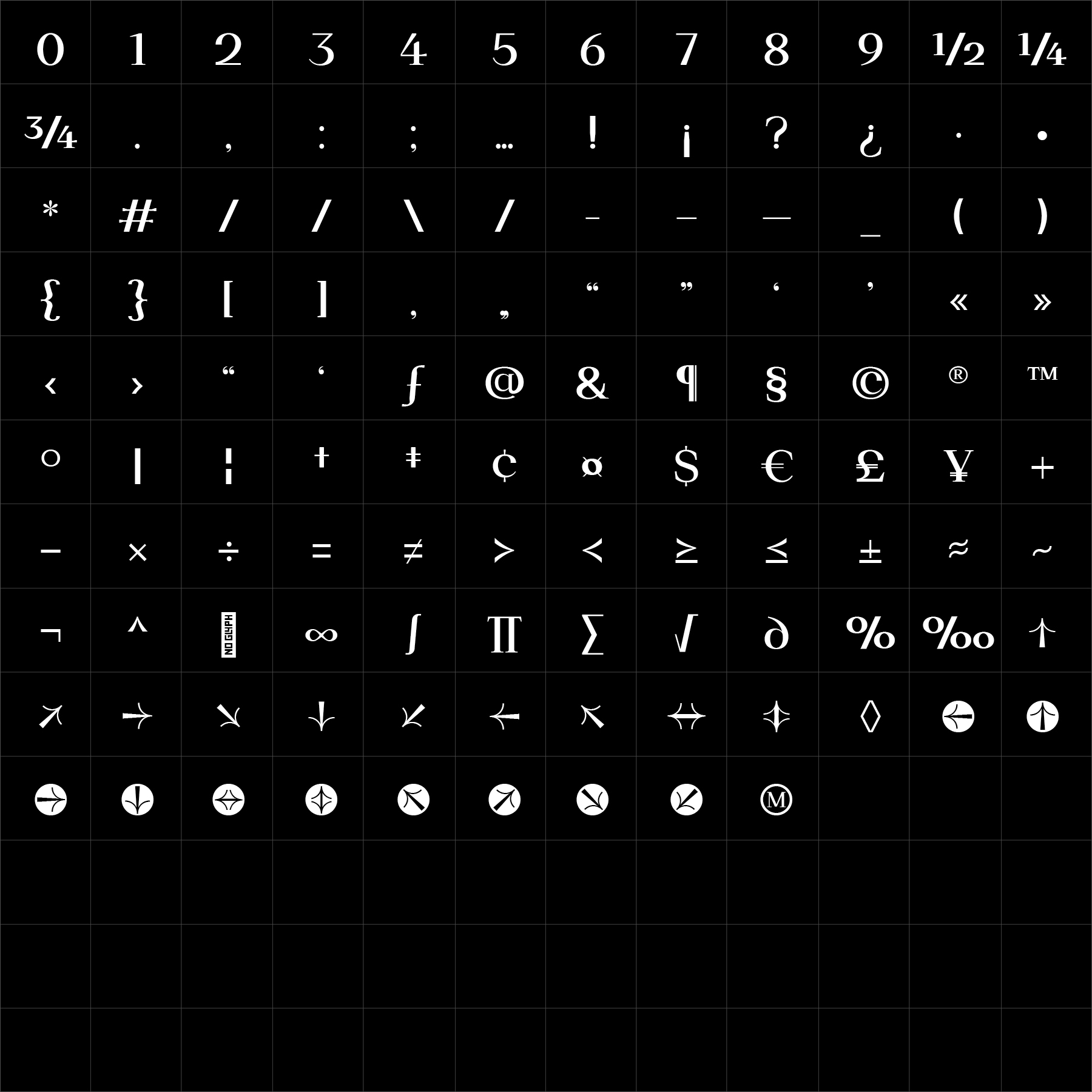
Hucks Serif is an editorial family shaped by strong proportions, sharp detailing and a confident visual presence. It balances classical serif structure with a more direct attitude, creating typography that feels authoritative, refined and distinctly current.
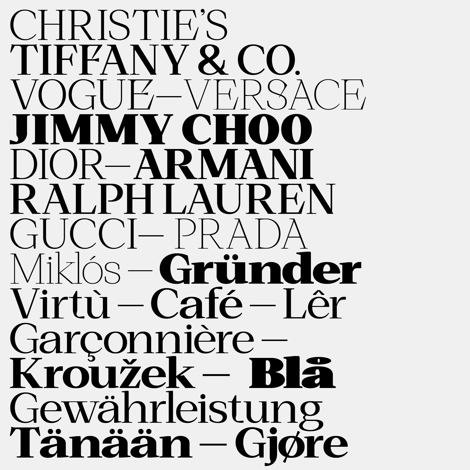
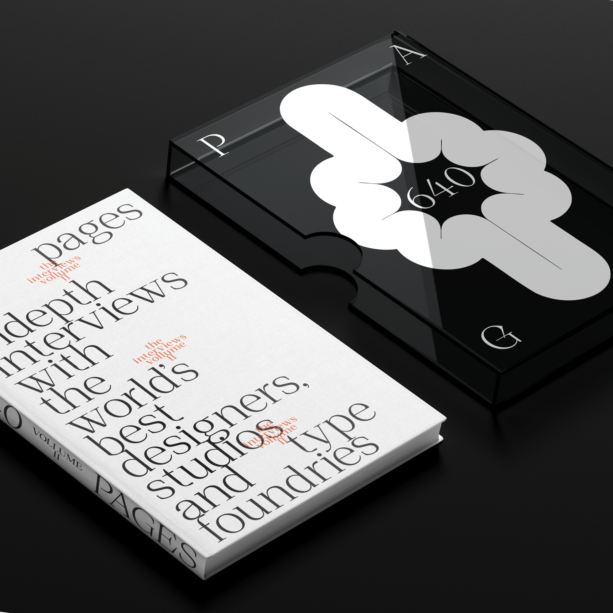
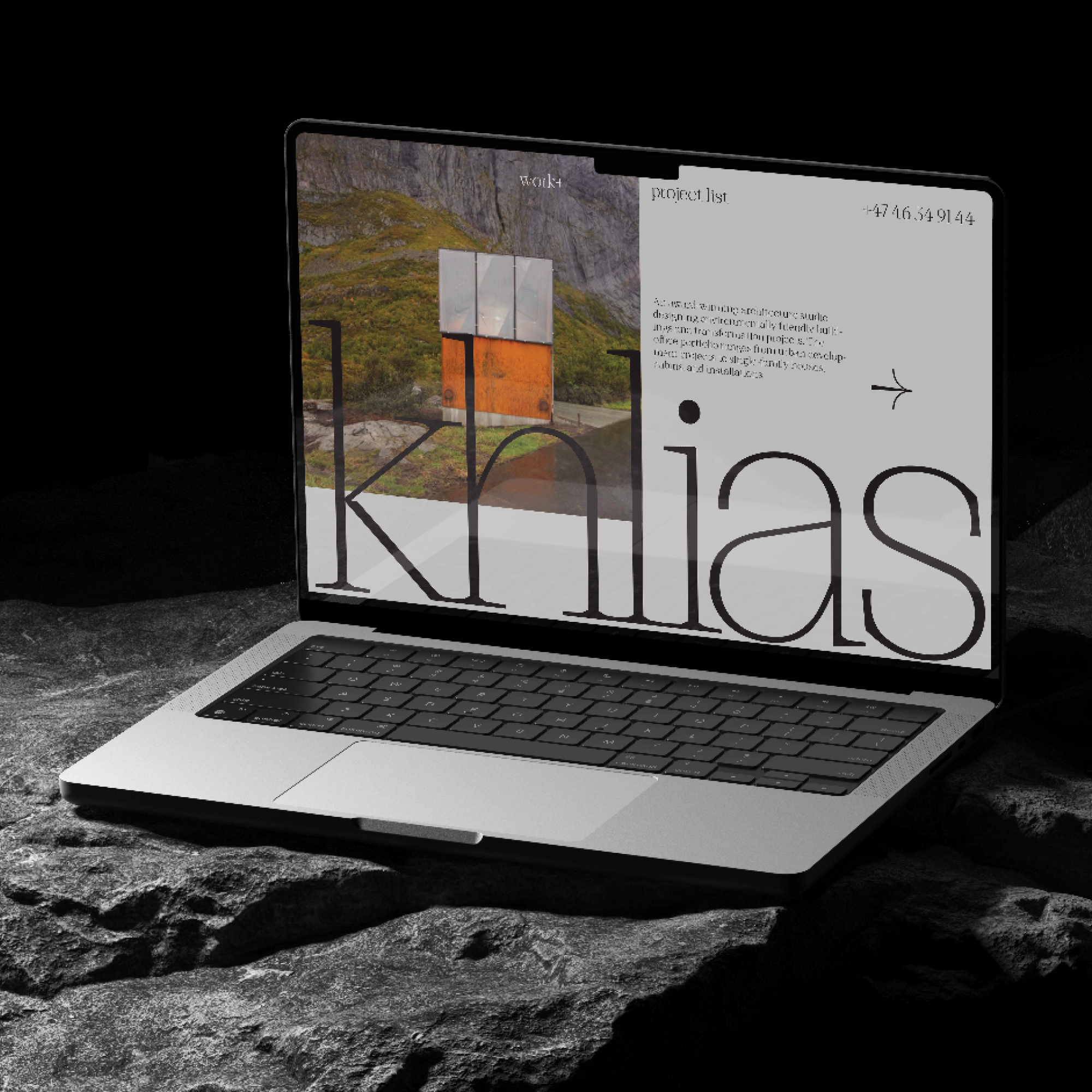
Its extensive weight range allows Hucks Serif to move between elegant display typography and structured editorial hierarchy. It performs particularly well in publishing, branding, packaging and cultural communication where language needs depth, precision and character.
Hucks Serif offers a refined typographic voice with balanced rhythm and sharp clarity, giving designers a flexible family for communication that must feel both considered and assured.
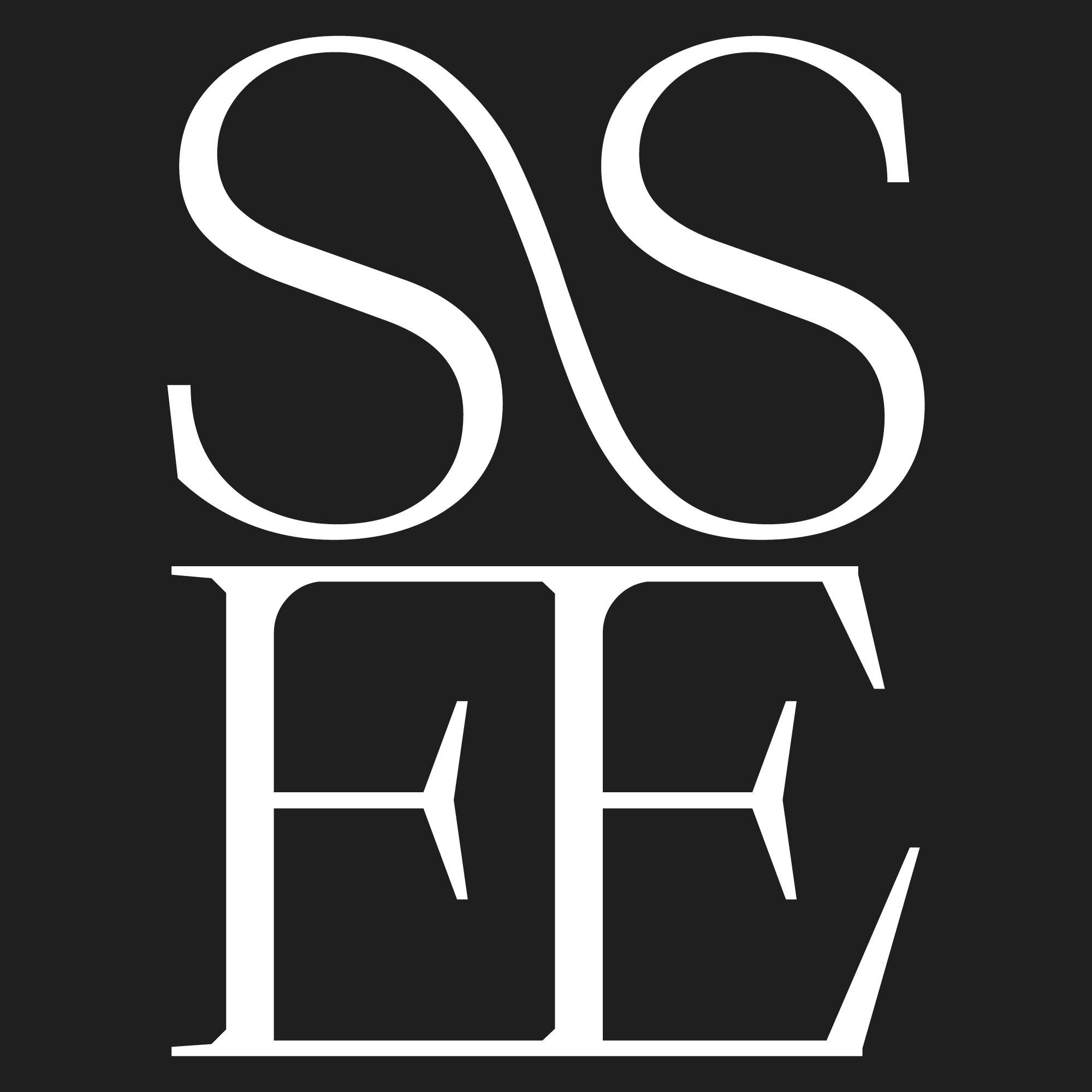
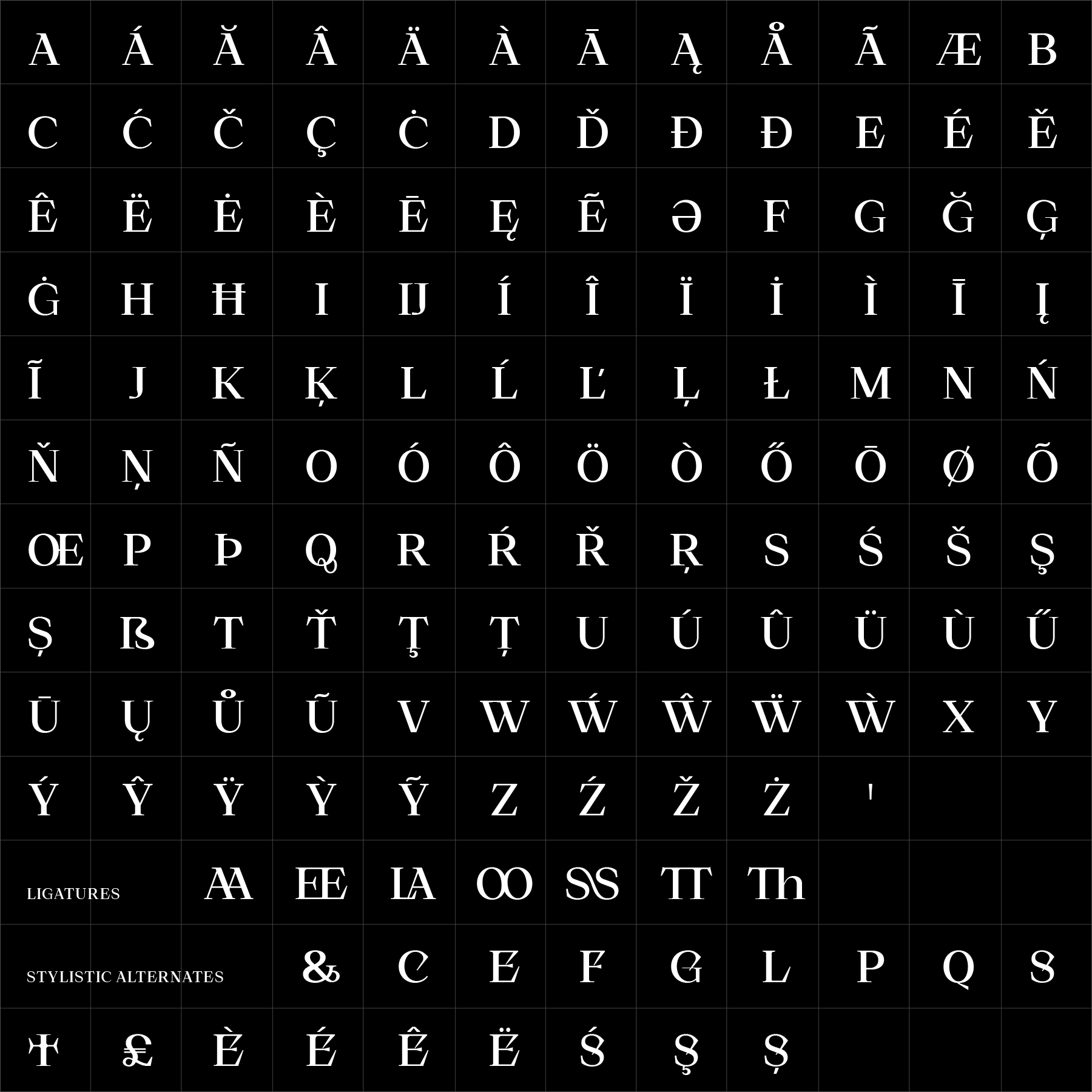
Hucks Serif can be adapted specifically for your brand—from individual characters and stylistic alternates to tailored weights, proportions or a complete proprietary serif family.