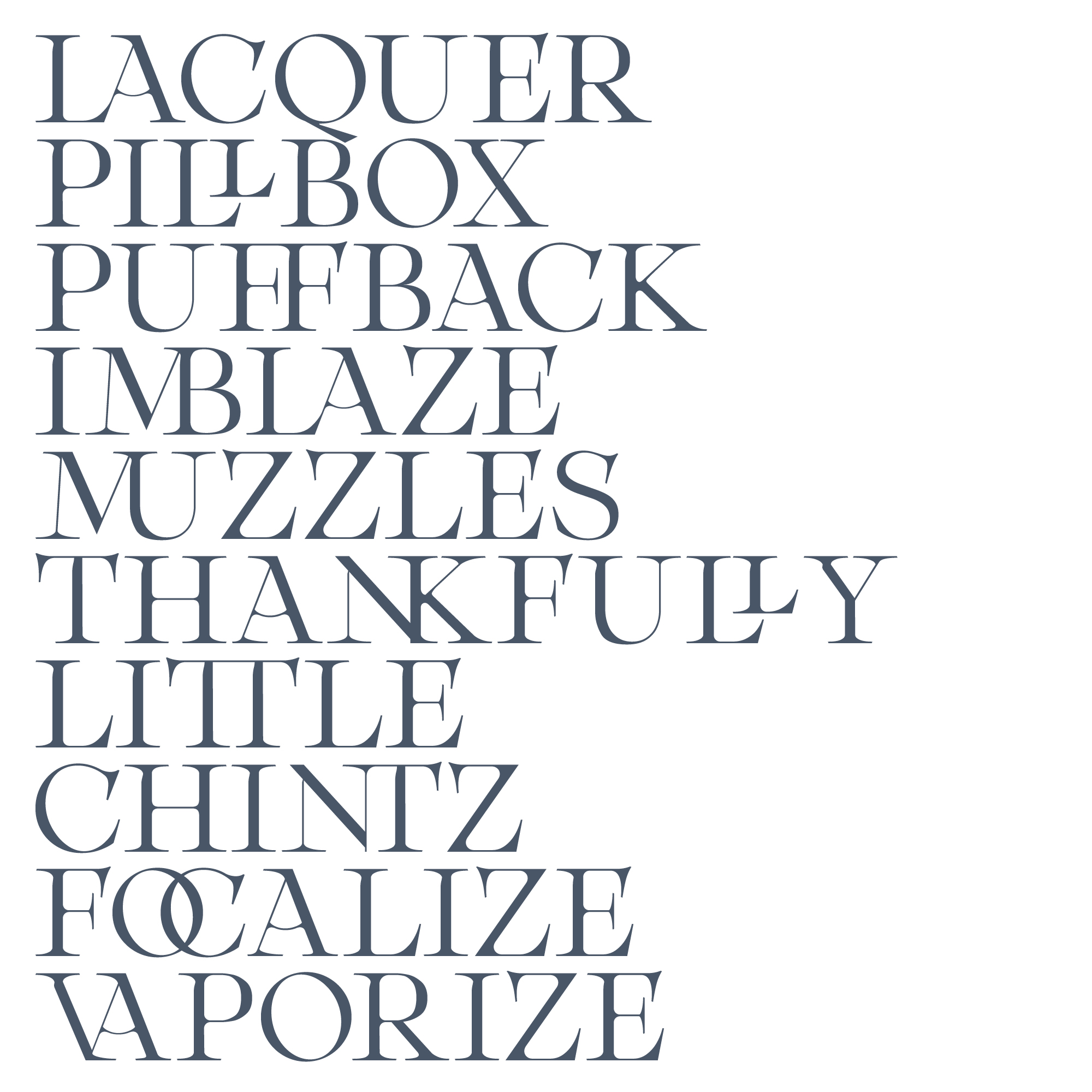
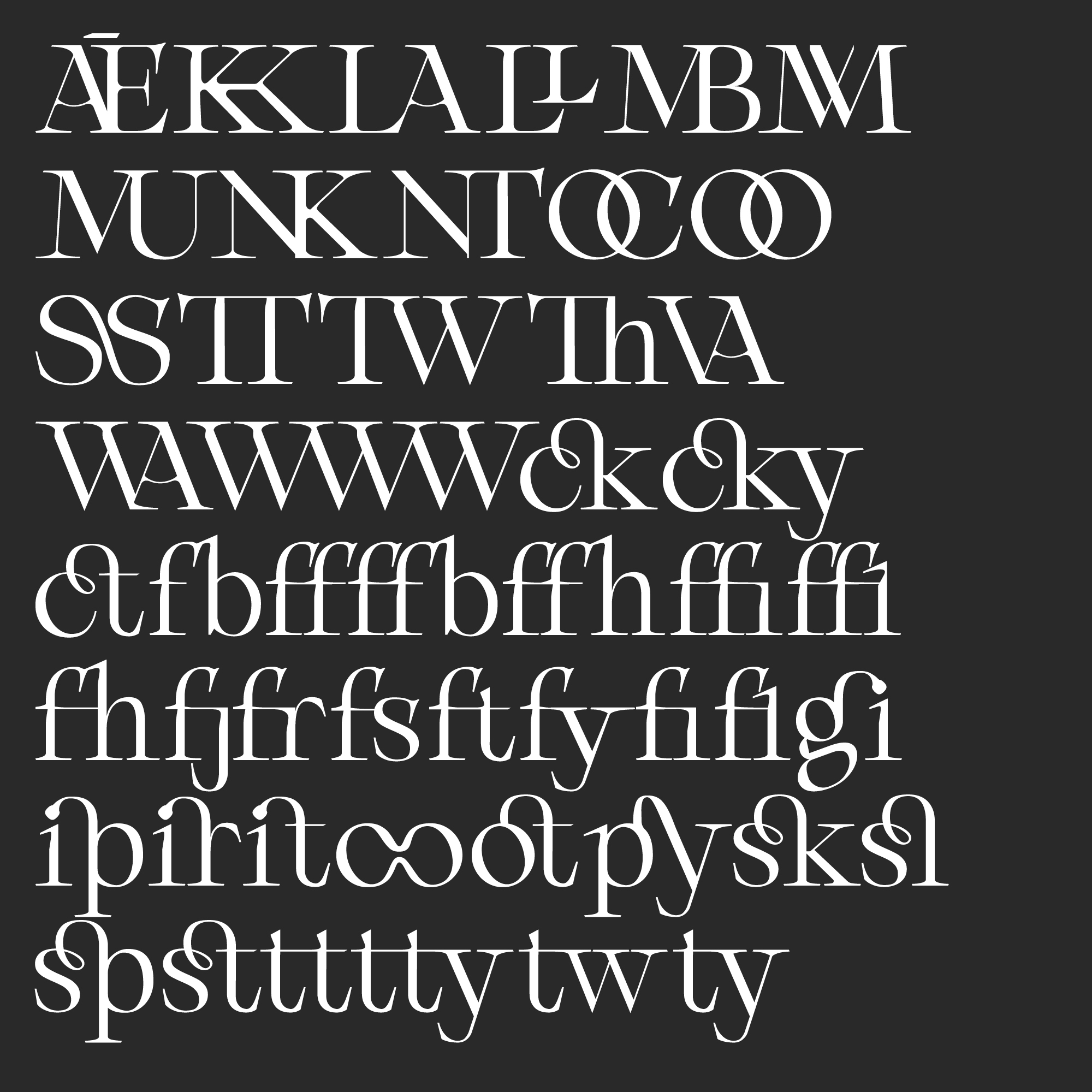
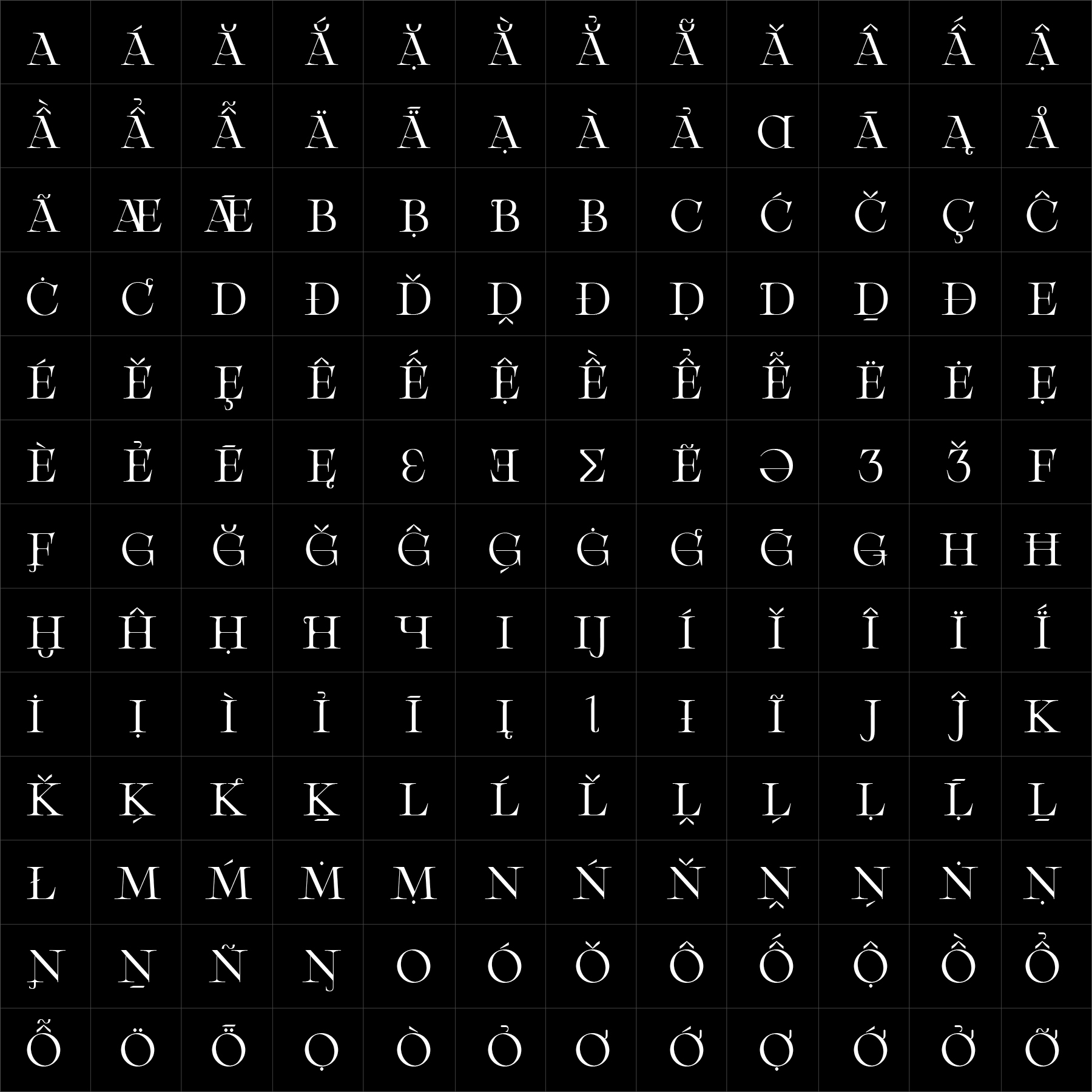
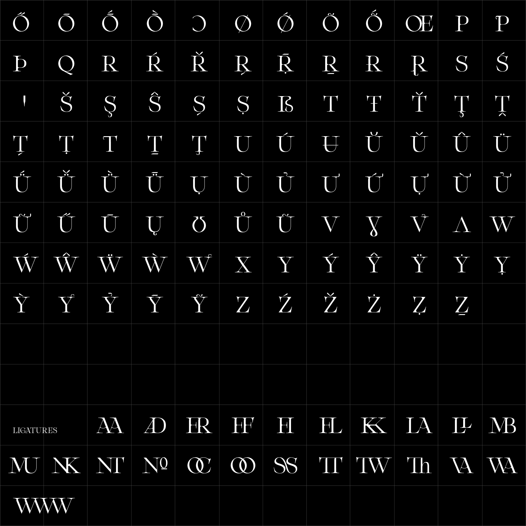
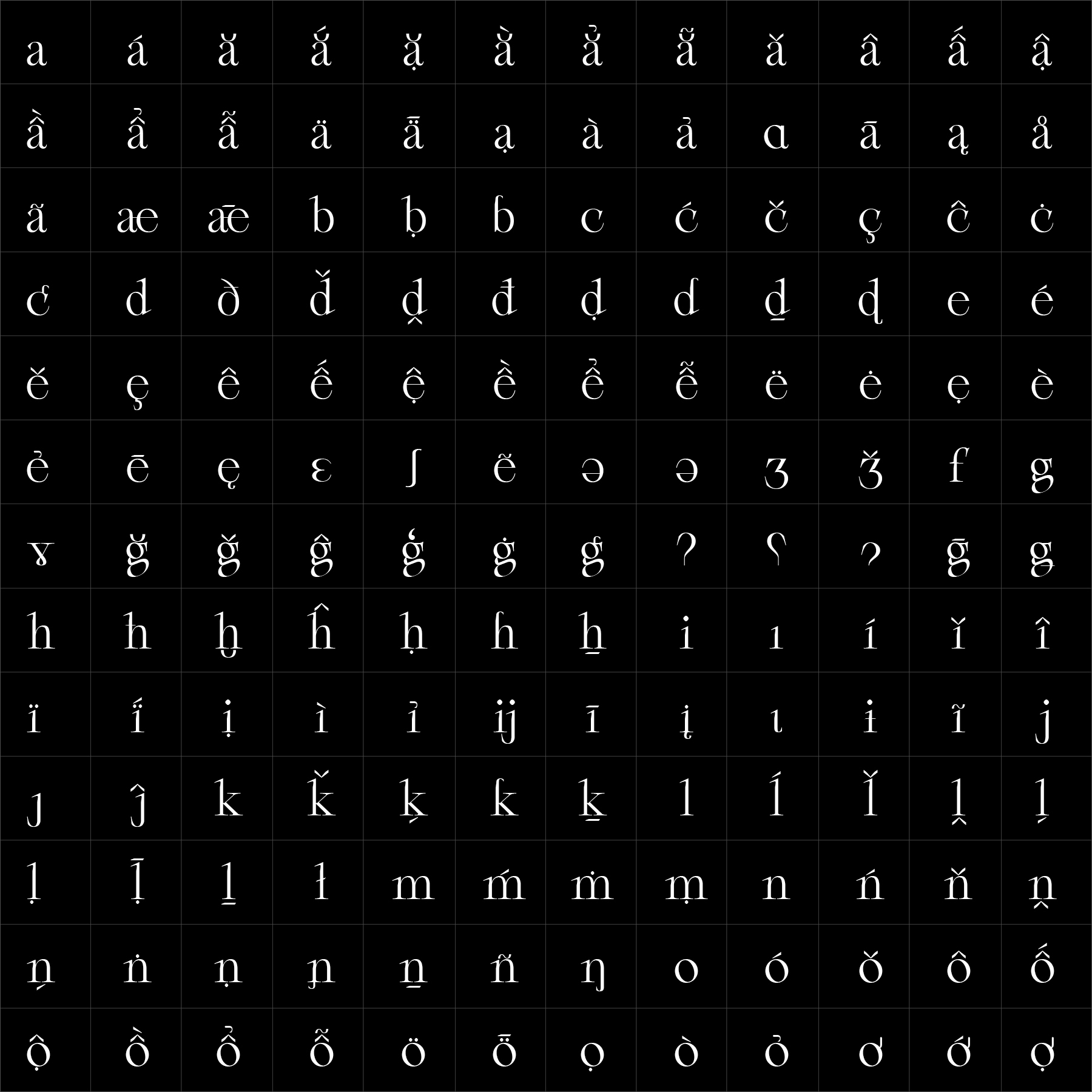
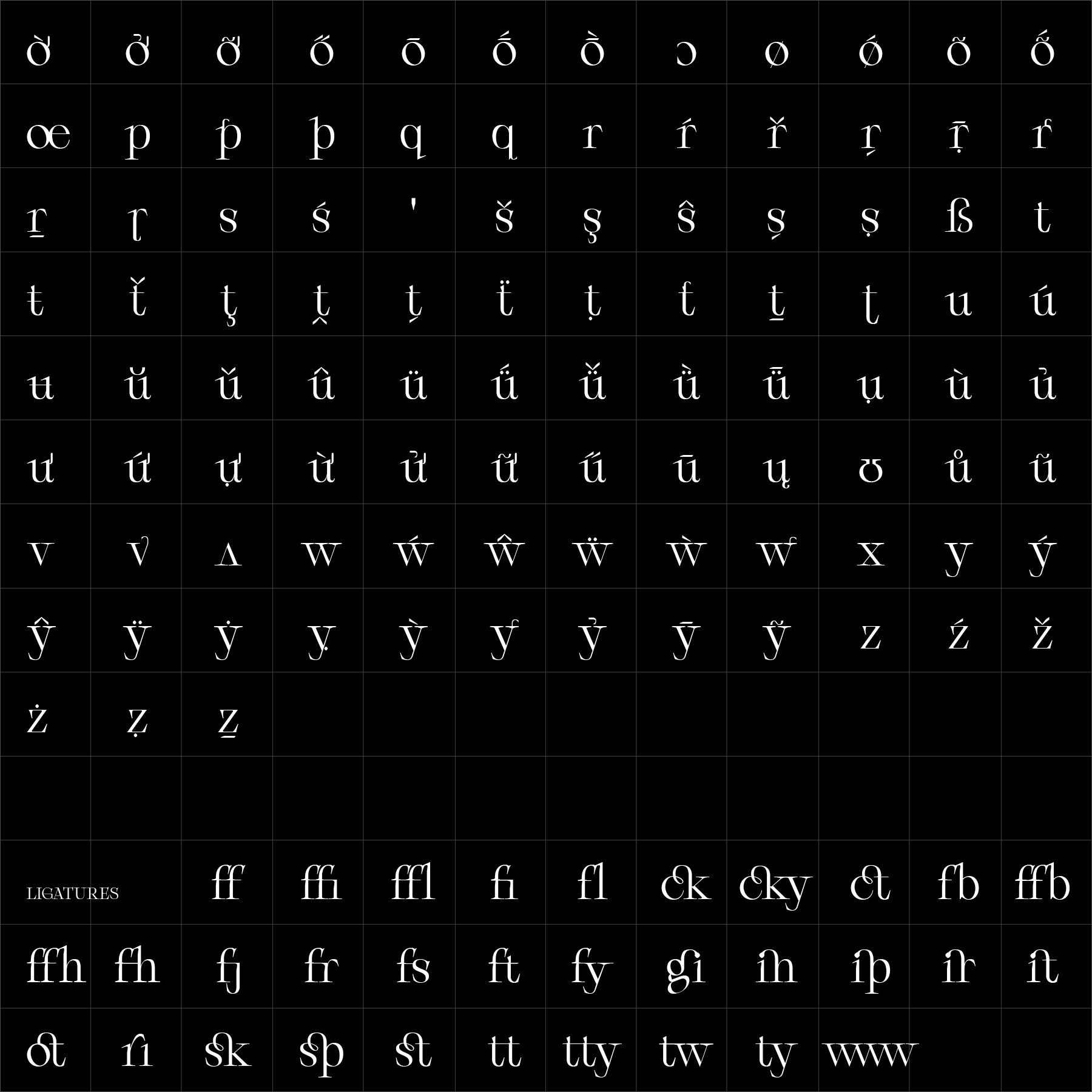
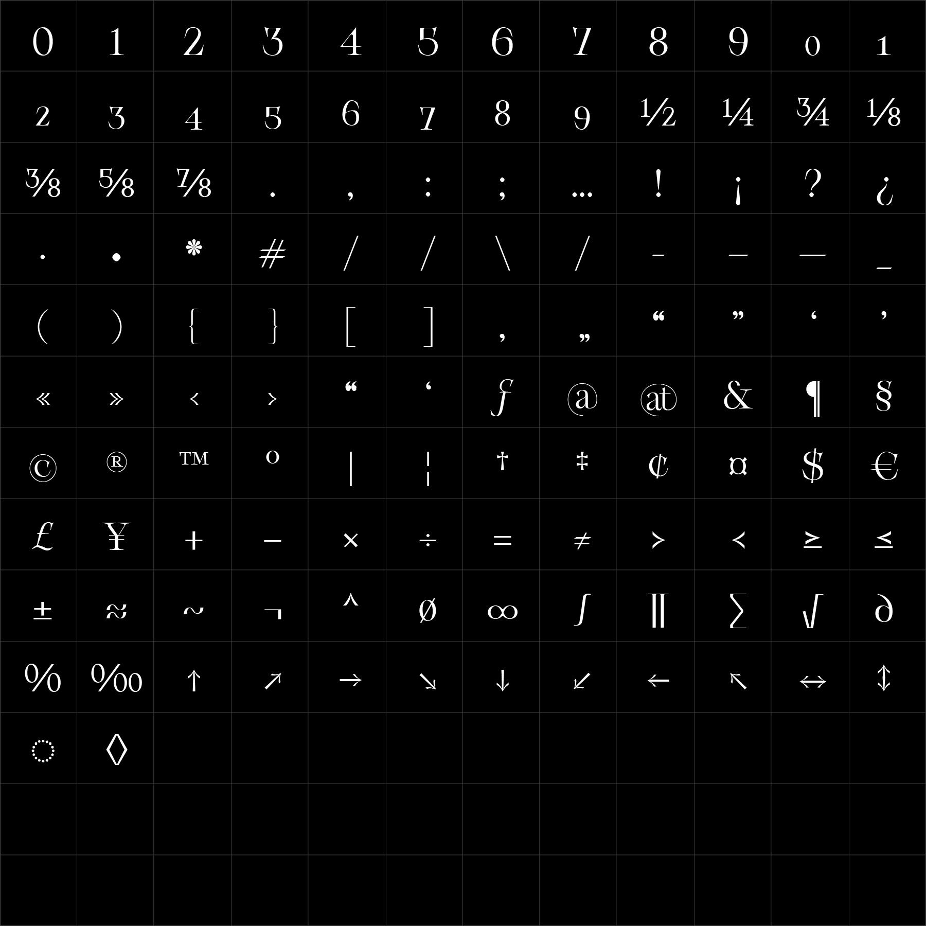
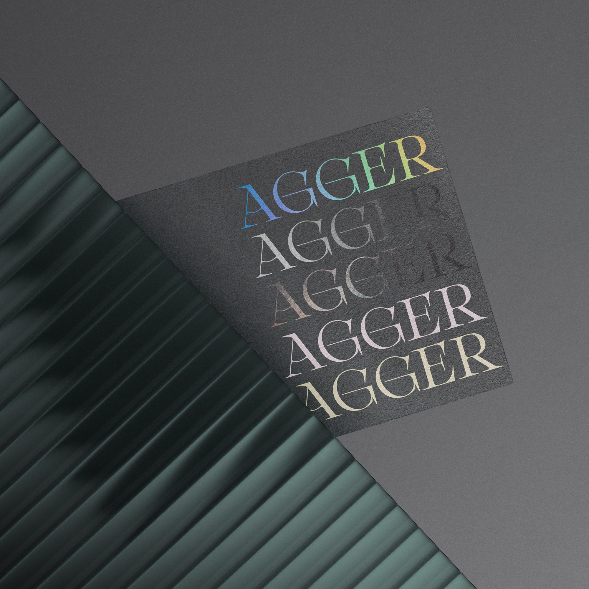
Agger Serif is a high-contrast family shaped by generous counters, flowing curves and carefully controlled details. Its open construction creates a refined typographic texture while maintaining clarity, warmth and a confident editorial presence.
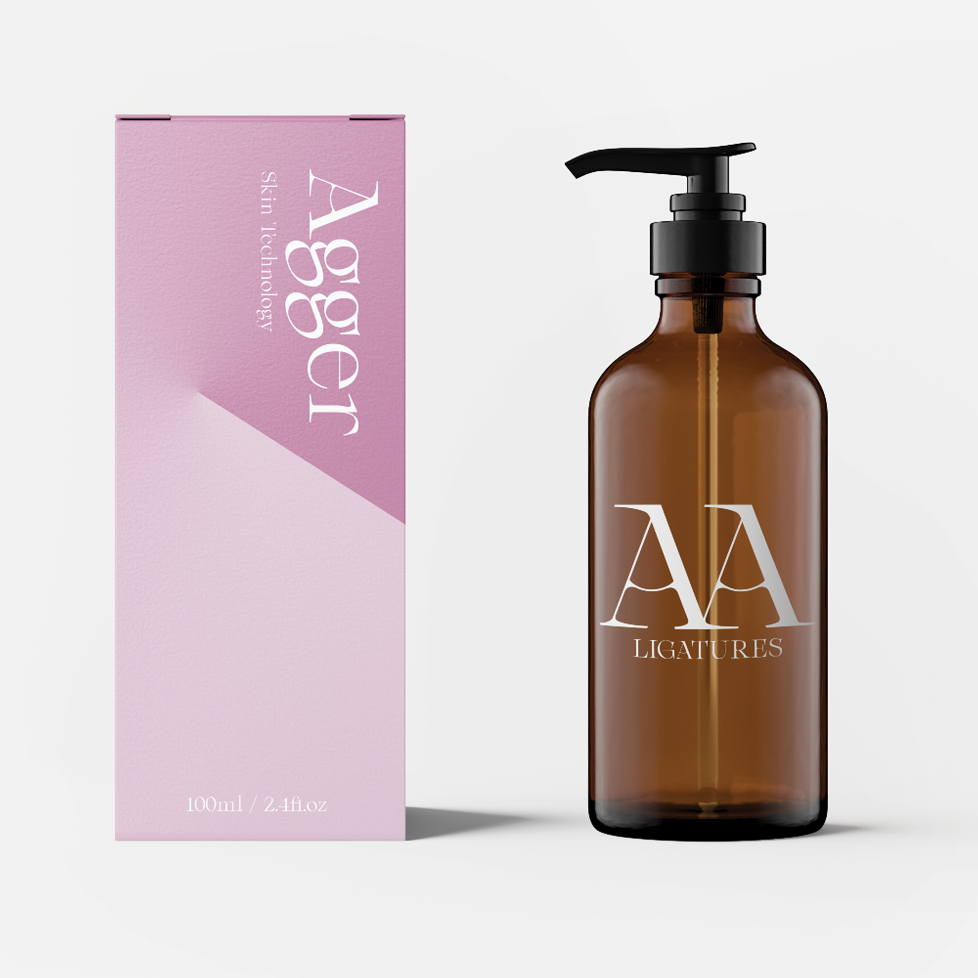
Agger Serif performs naturally across visual identities, publishing, fashion communication, packaging and cultural projects where typography must communicate distinction without excess. Its proportions balance classical serif influence with a sharper and more direct attitude. Agger Serif offers designers a distinctive display and editorial voice with expressive contrast, stable readability and enough flexibility to move between restrained and emphatic communication.
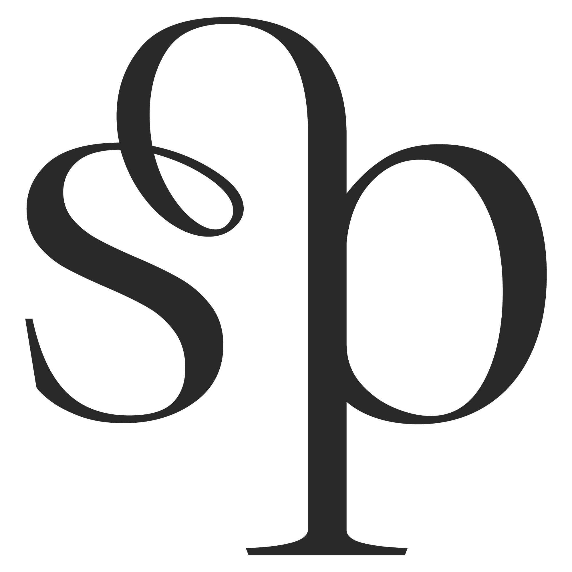
Agger Serif can be adapted specifically for your brand—from individual characters and stylistic details to adjusted proportions, additional weights, language support or a complete proprietary serif family.