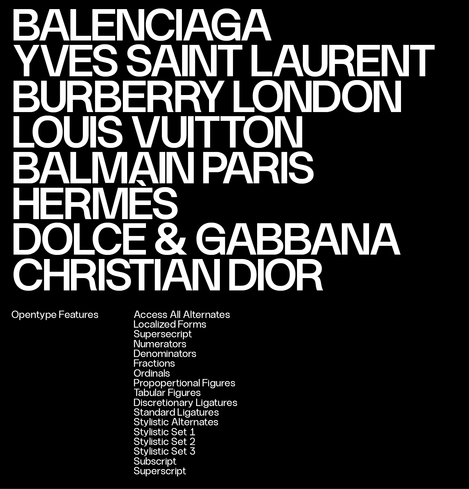
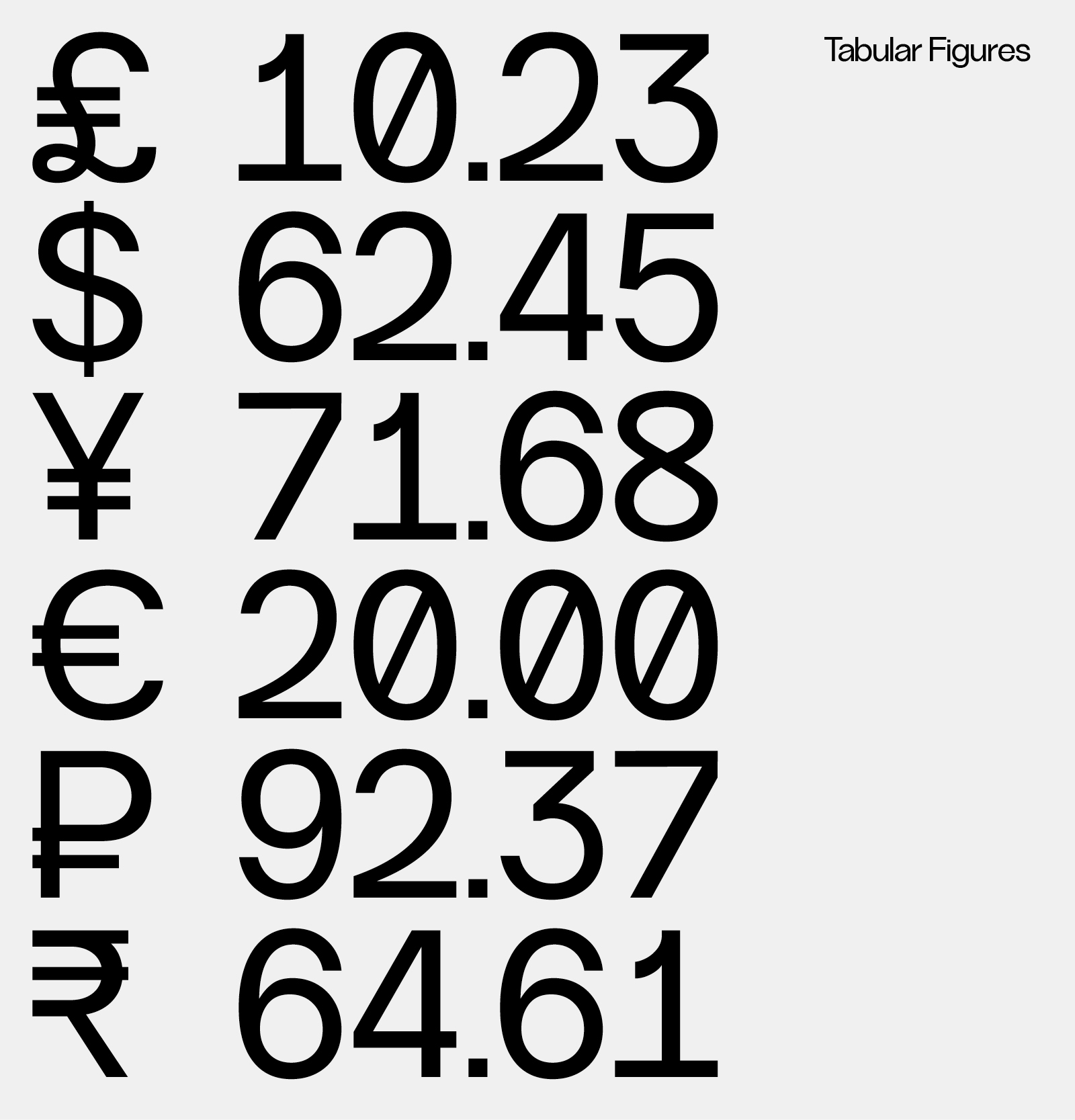
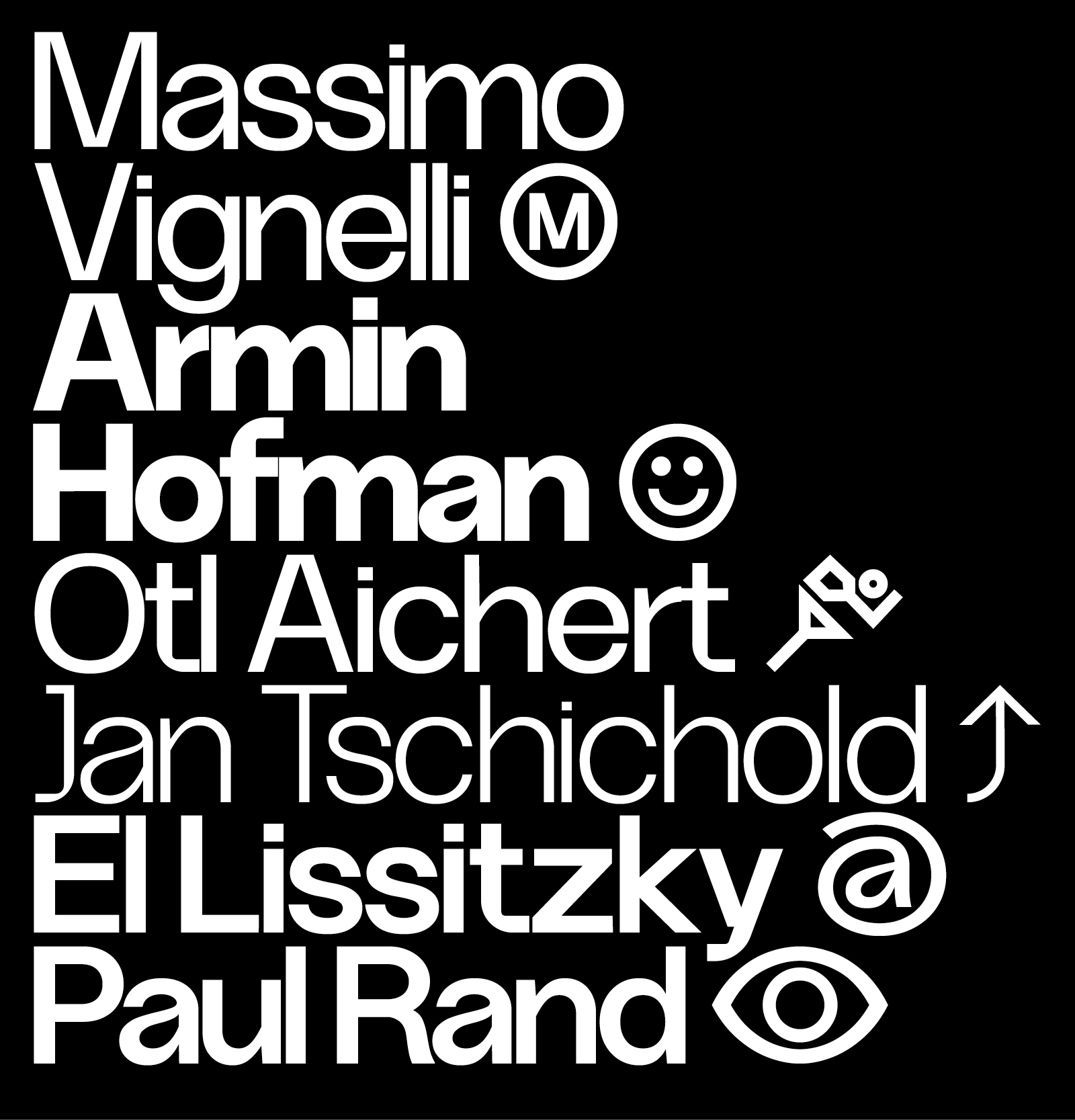
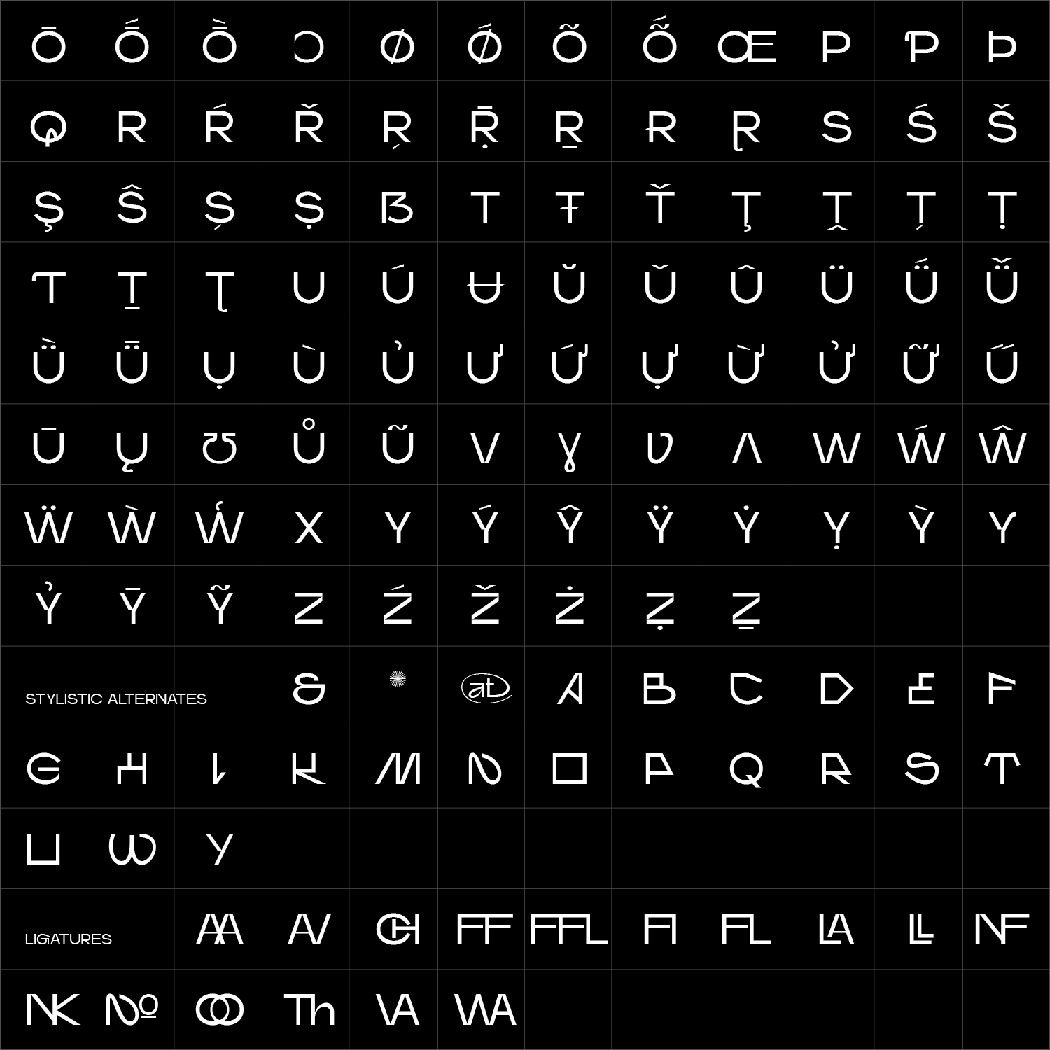
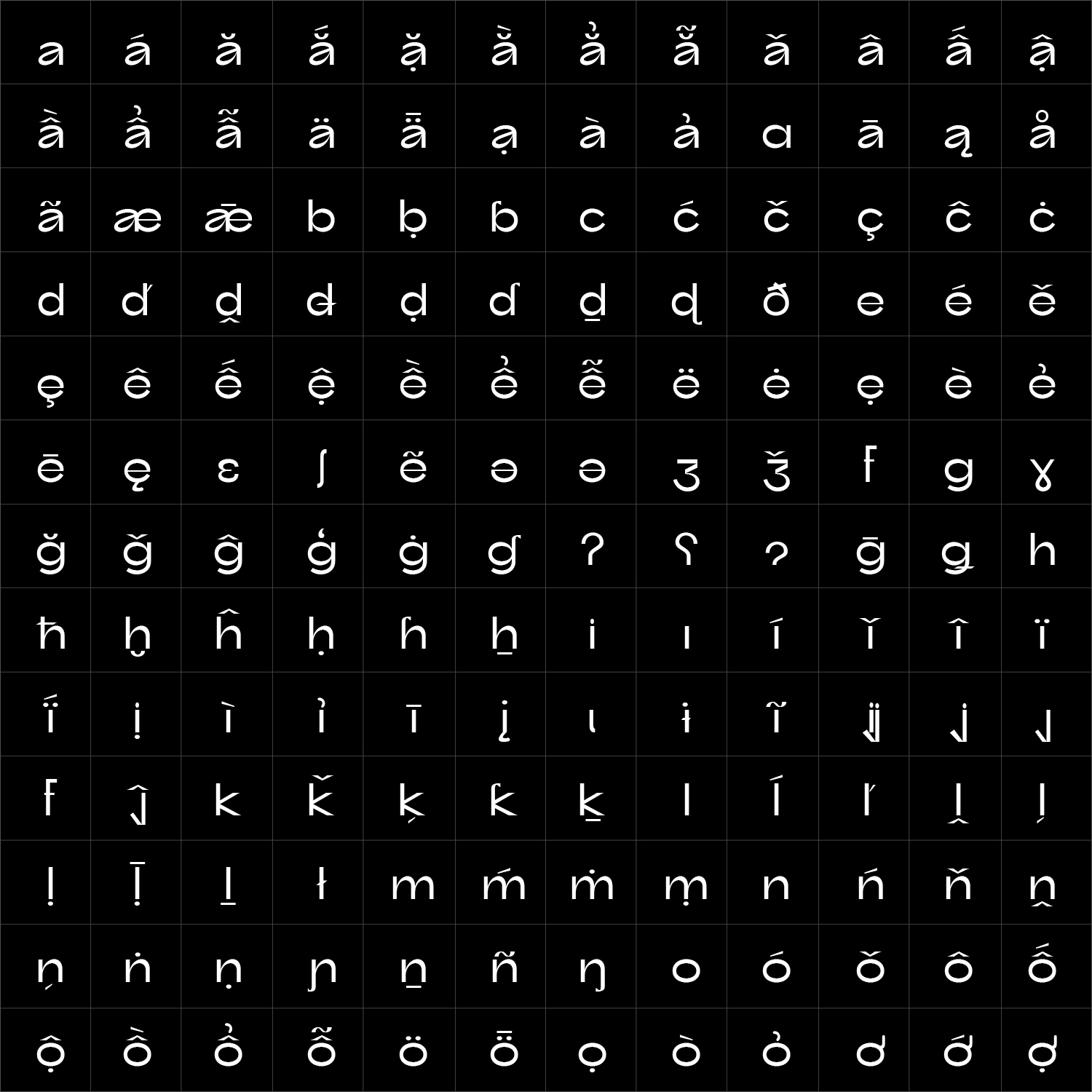
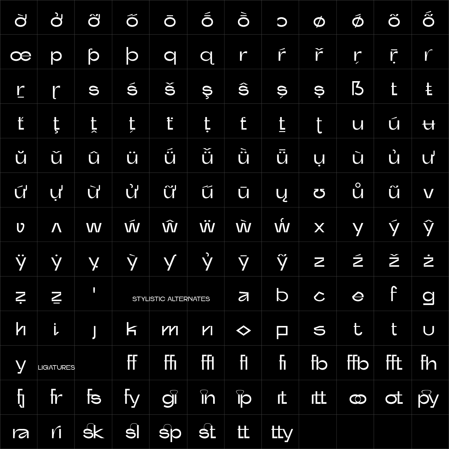
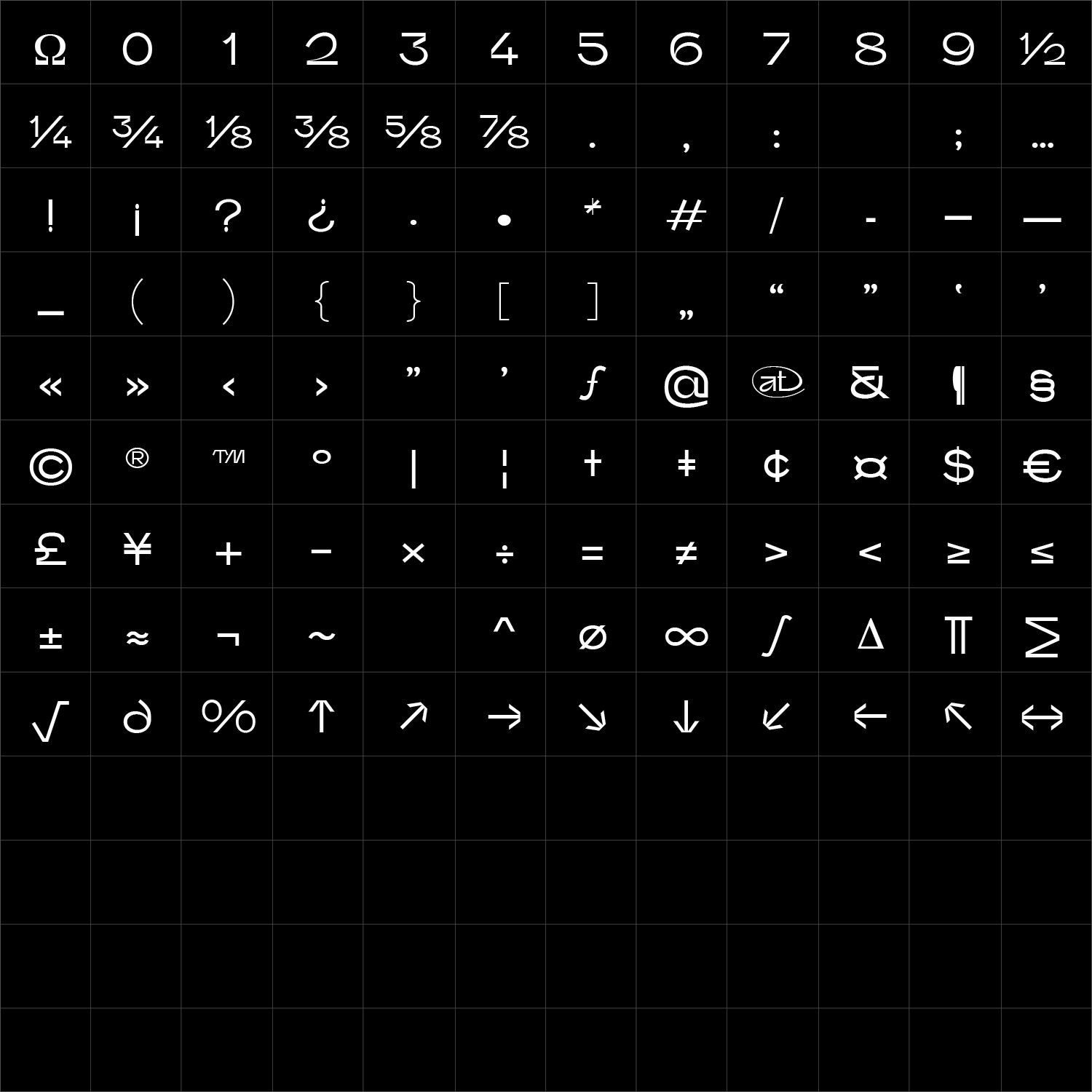
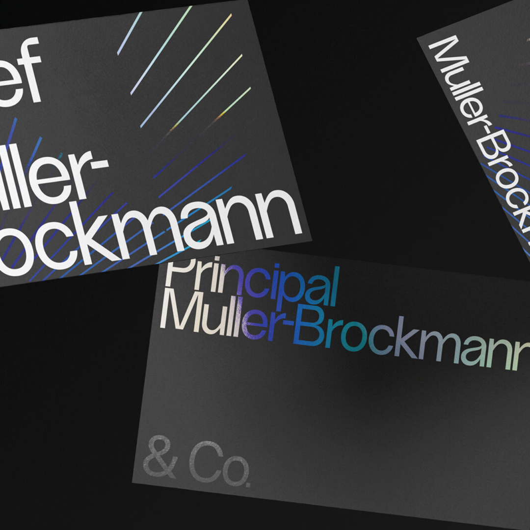
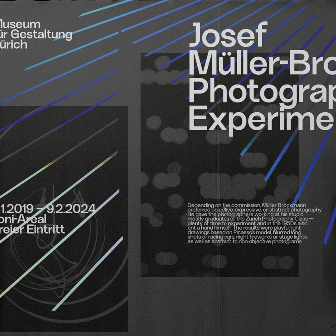
Faffin Sans is built from clear geometric structures, balanced by optical adjustments that keep the forms open and natural. Its direct construction creates a confident typographic voice without sacrificing rhythm, clarity or ease of use.
Its six weights and corresponding Italics allow Faffin Sans to move easily between identity, editorial and digital systems. The family builds clear hierarchy while maintaining a consistent and recognisable voice across different scales and applications. Faffin Sans is designed to work alongside Faffin Display, extending the family from controlled sans-serif typography into more expressive display applications.
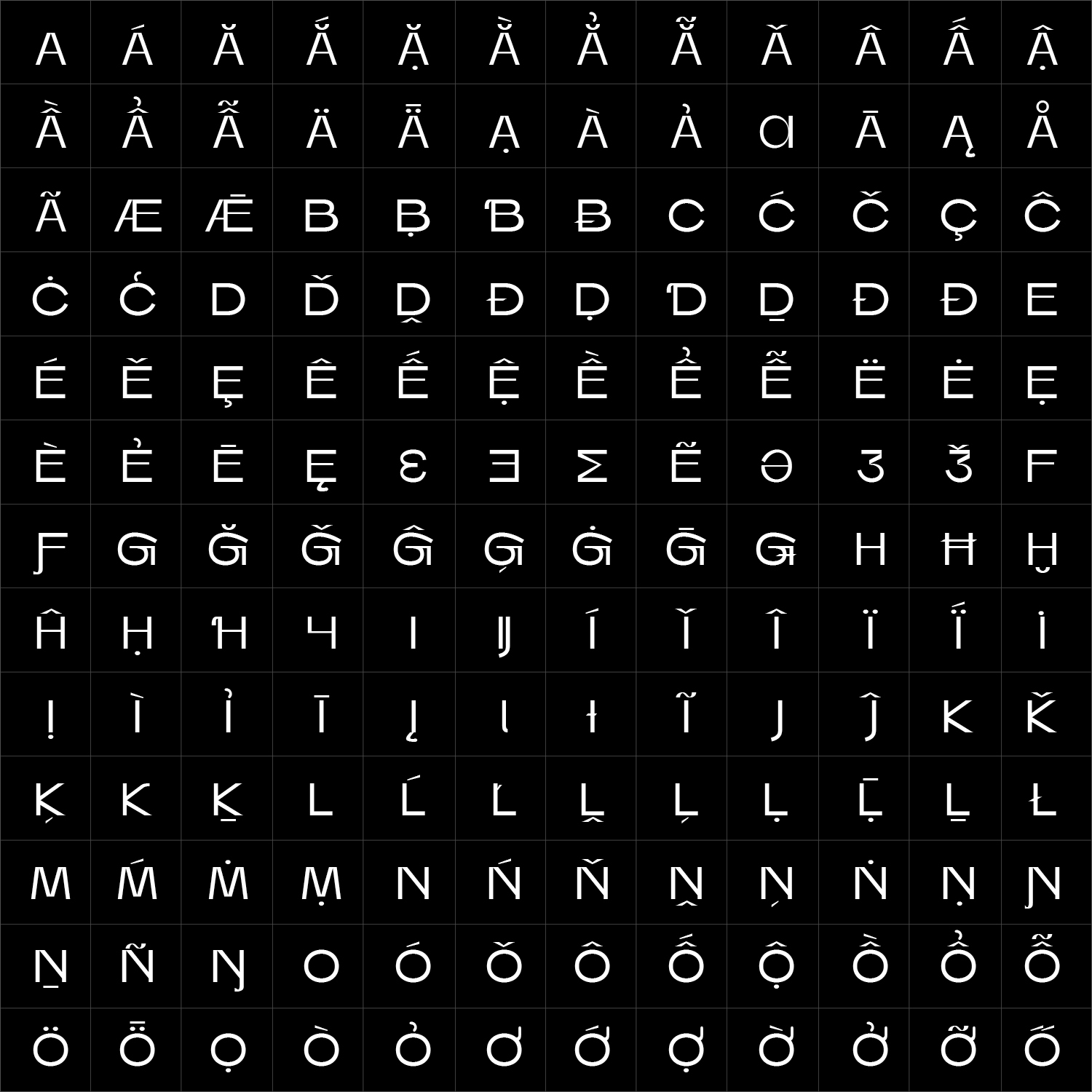
Faffin Sans can be adapted specifically for your brand—from individual characters and stylistic alternates to adjusted proportions, additional weights, language support or a complete proprietary family.