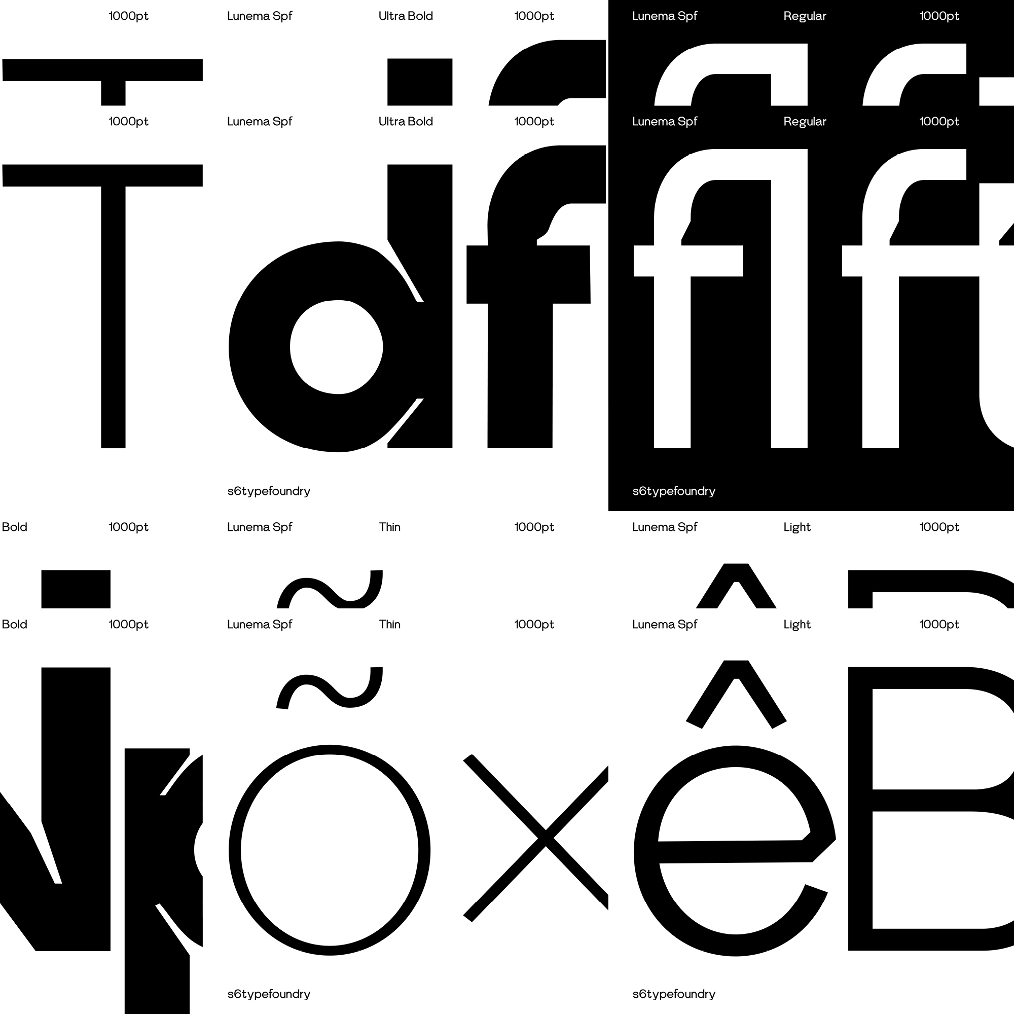
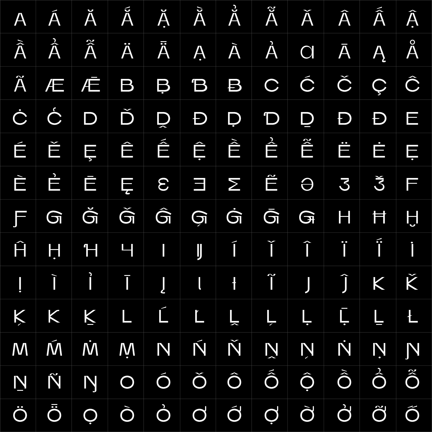
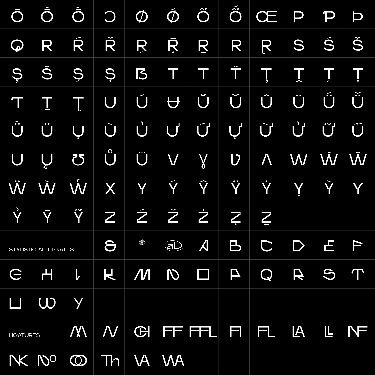
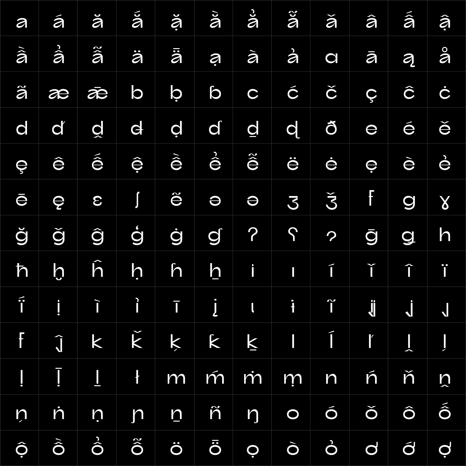
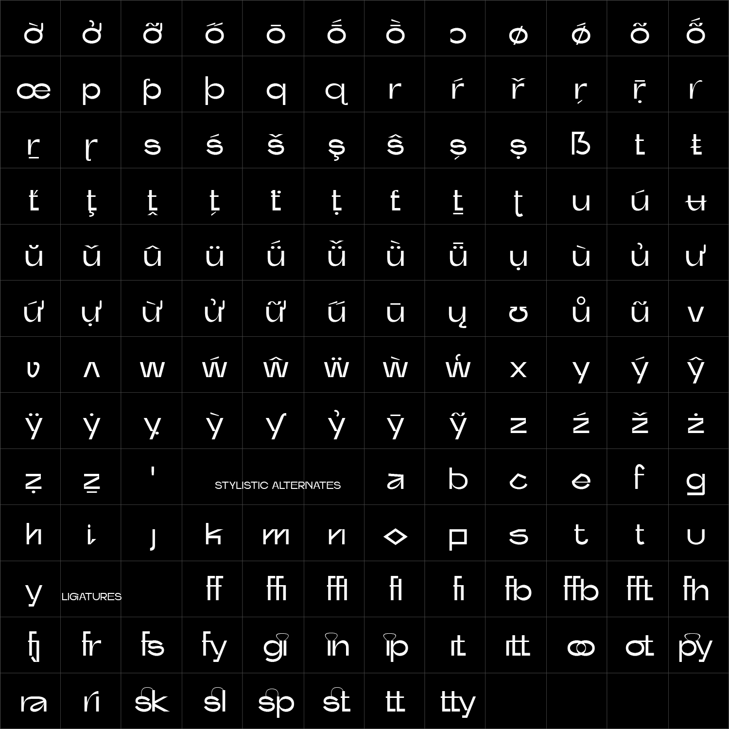
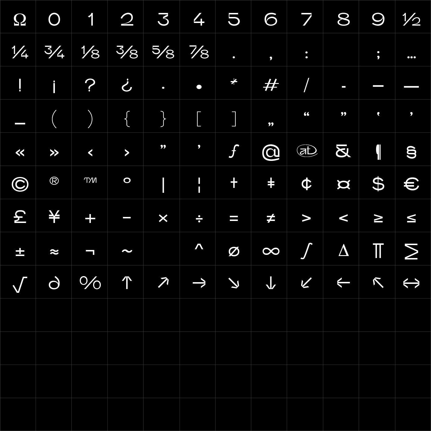
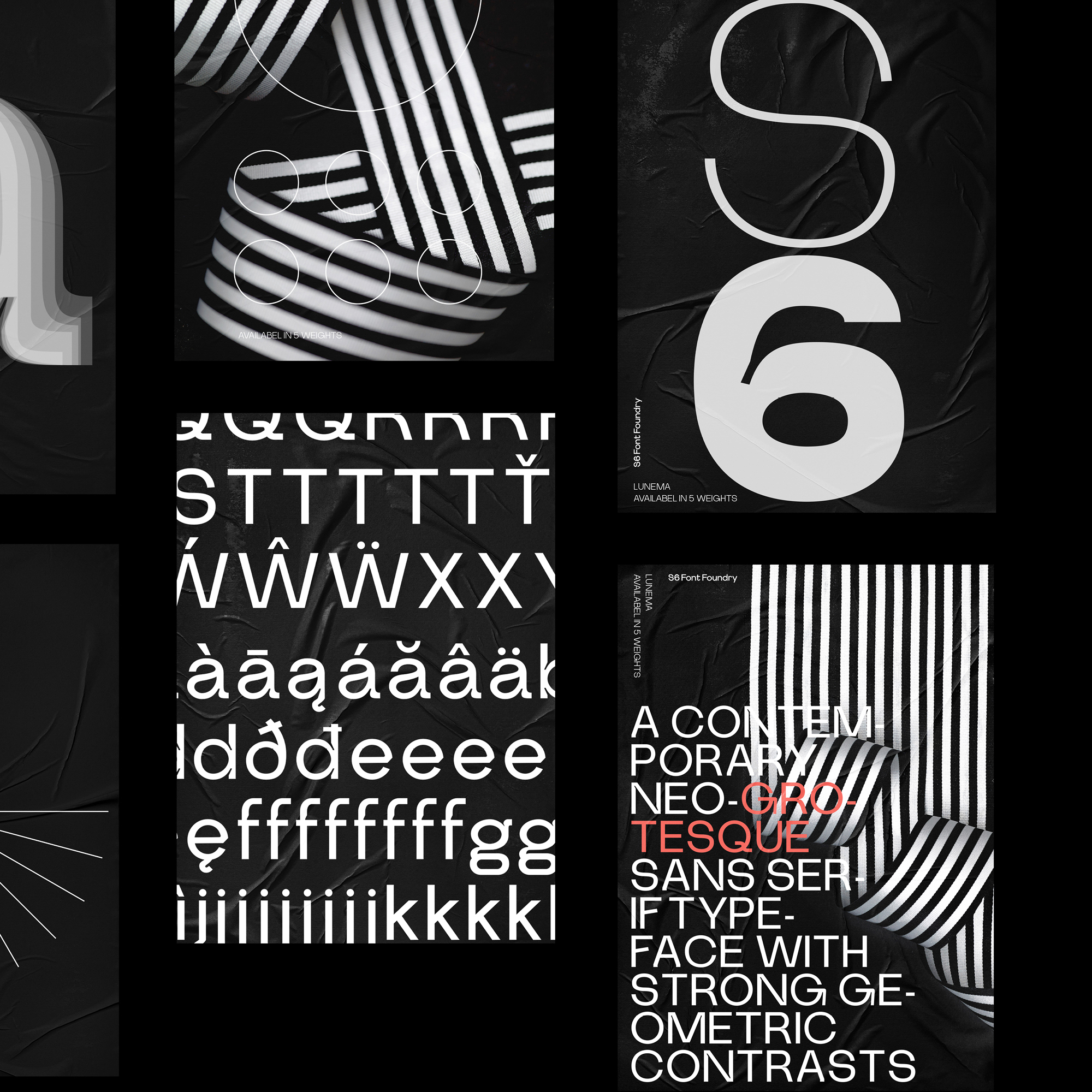
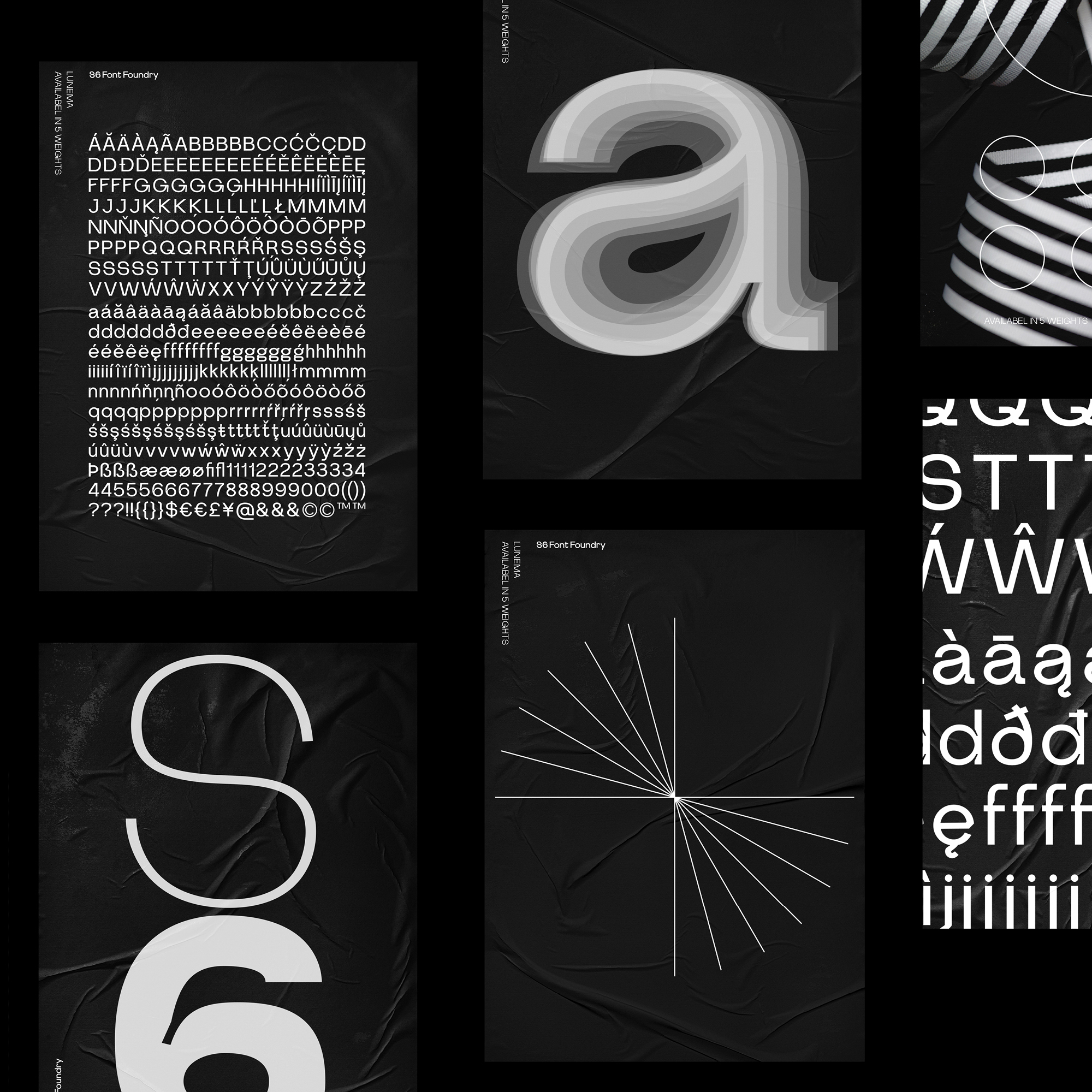
Lunema Sans uses sharply defined inktraps and controlled internal cuts to give a functional structure a distinctive visual edge. These details open the letterforms, strengthen their rhythm and become increasingly expressive as the type grows in scale.
From compact interface typography to editorial layouts, identities and commanding display text, Lunema balances clarity with character. Its weights and italics allow information to move between quiet organisation and strong graphic emphasis while maintaining a consistent and recognisable voice.
Lunema Sans can be adapted specifically for your brand—from selected characters and inktrap details to proportions, weights, language support or a complete proprietary type system.