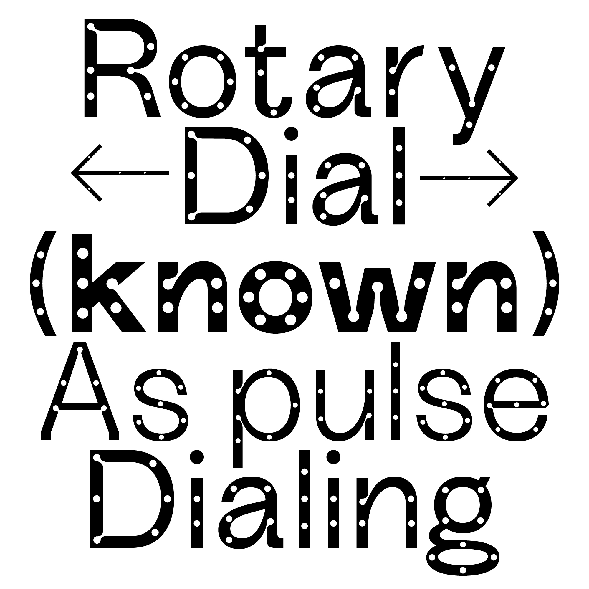
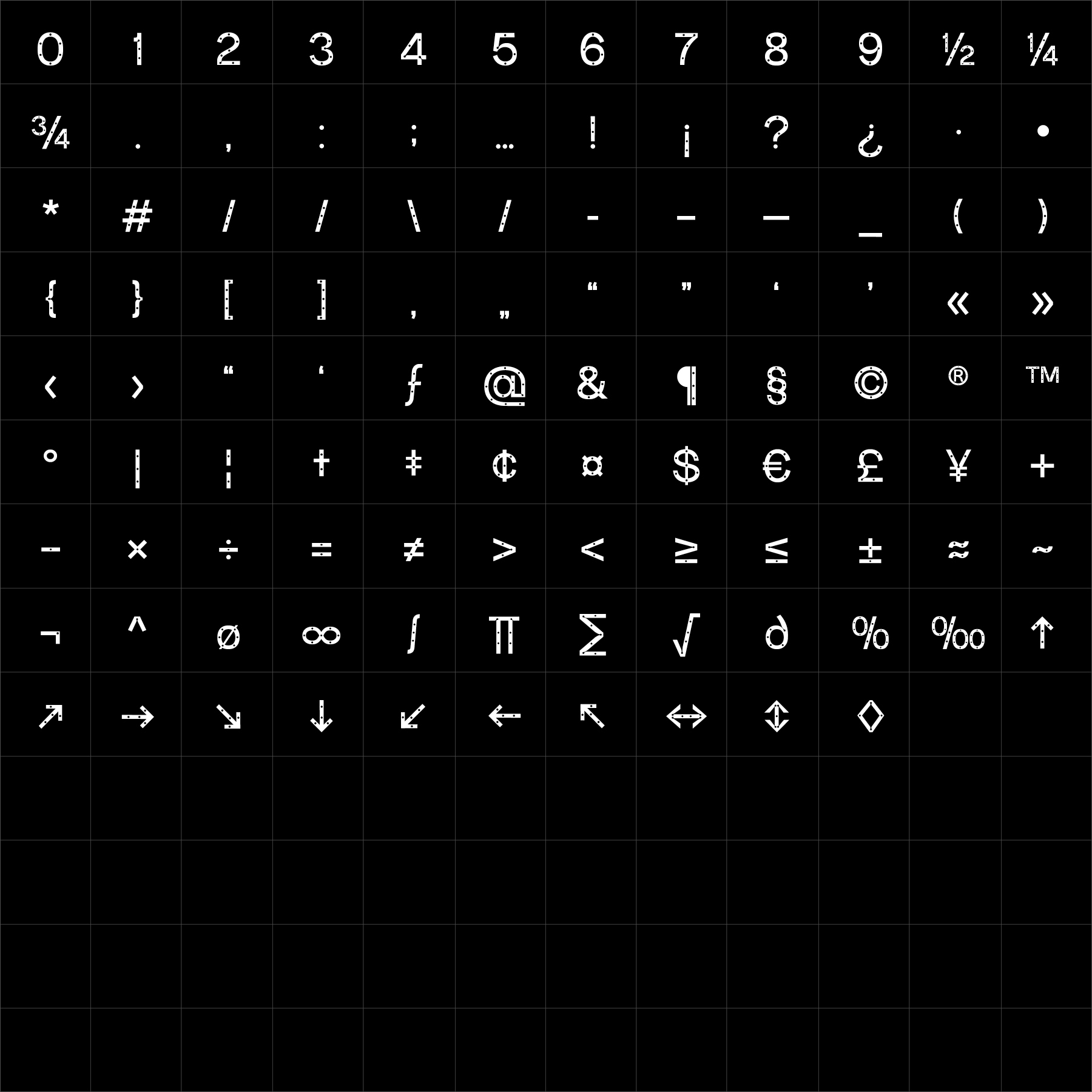
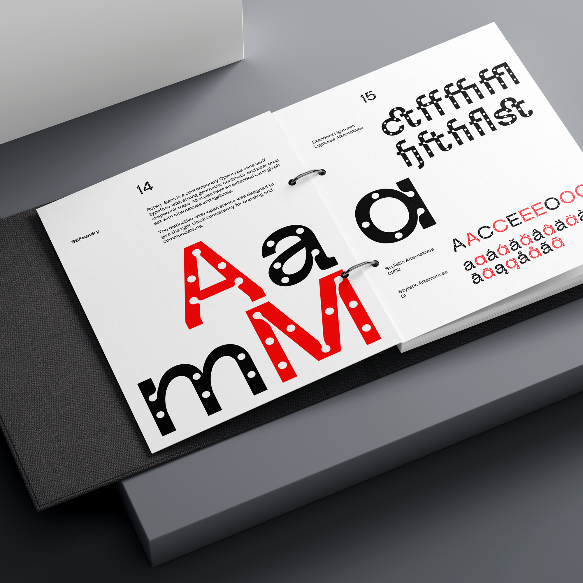
Rotary Sans is built from rounded geometry, smooth transitions and balanced proportions. Its soft curves create an approachable typographic voice while the controlled underlying structure keeps the family clear, dependable and visually consistent.
Rotary Sans performs naturally across branding, packaging, editorial systems and digital interfaces where typography needs to feel friendly and refined without becoming childish or overly playful. Rotary Sans offers designers a versatile family with smooth rhythm, balanced structure and a calm presence across print and digital communication.
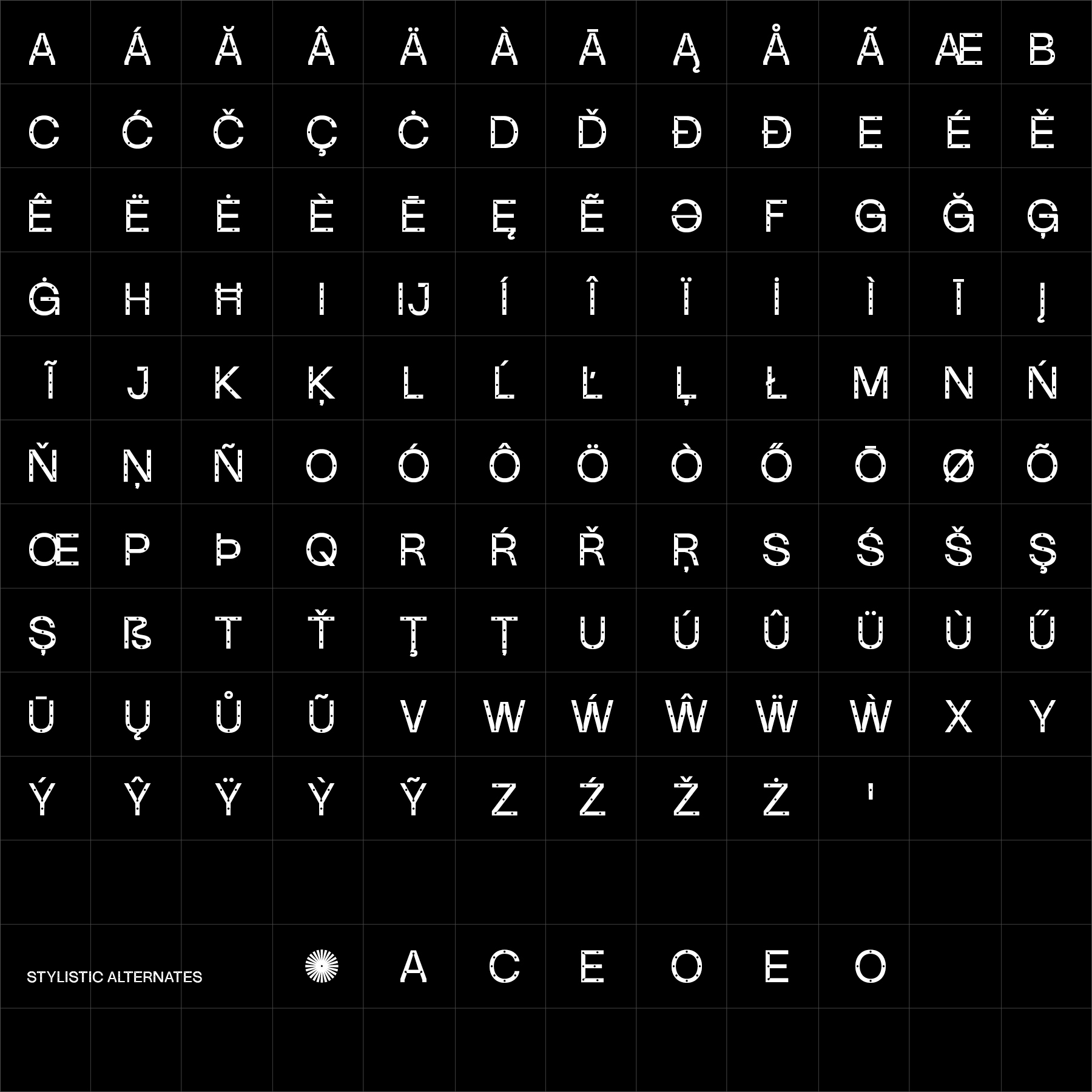
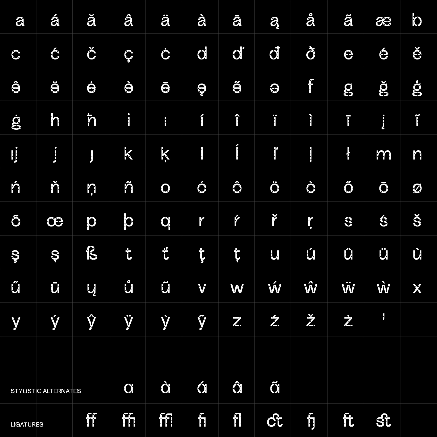
Rotary Sans can be adapted specifically for your brand—from individual characters and terminal details to adjusted proportions, additional weights, language support or a complete proprietary family.